Client: Liberty University, Professor: Brianna O'Neal
Master of Visual Communication Design
Course: Art532
Work: A to Z, Concept, Research, Sketch, Vector Illustration, Presentation
Year: 2021
CONCEPT & SKETCHES:
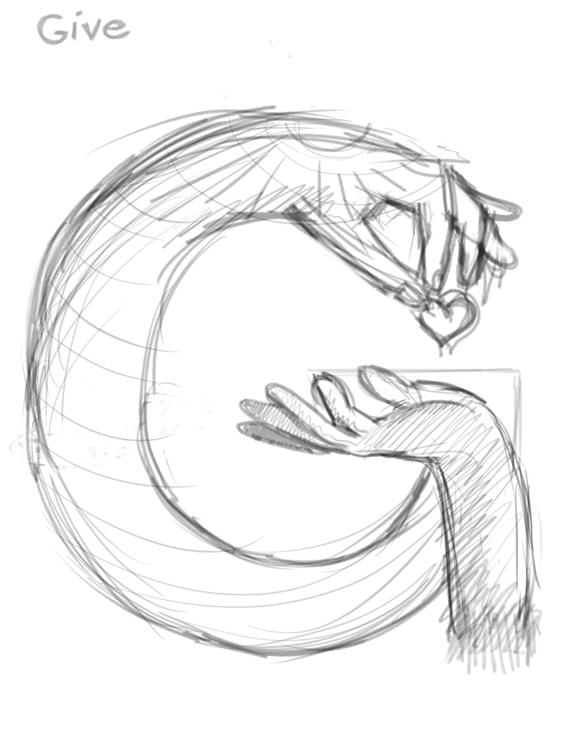
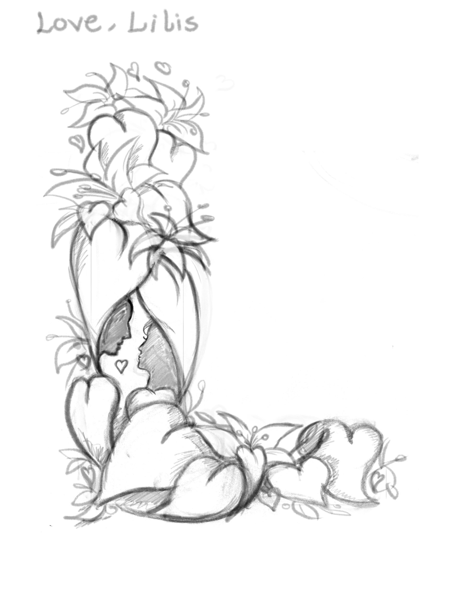
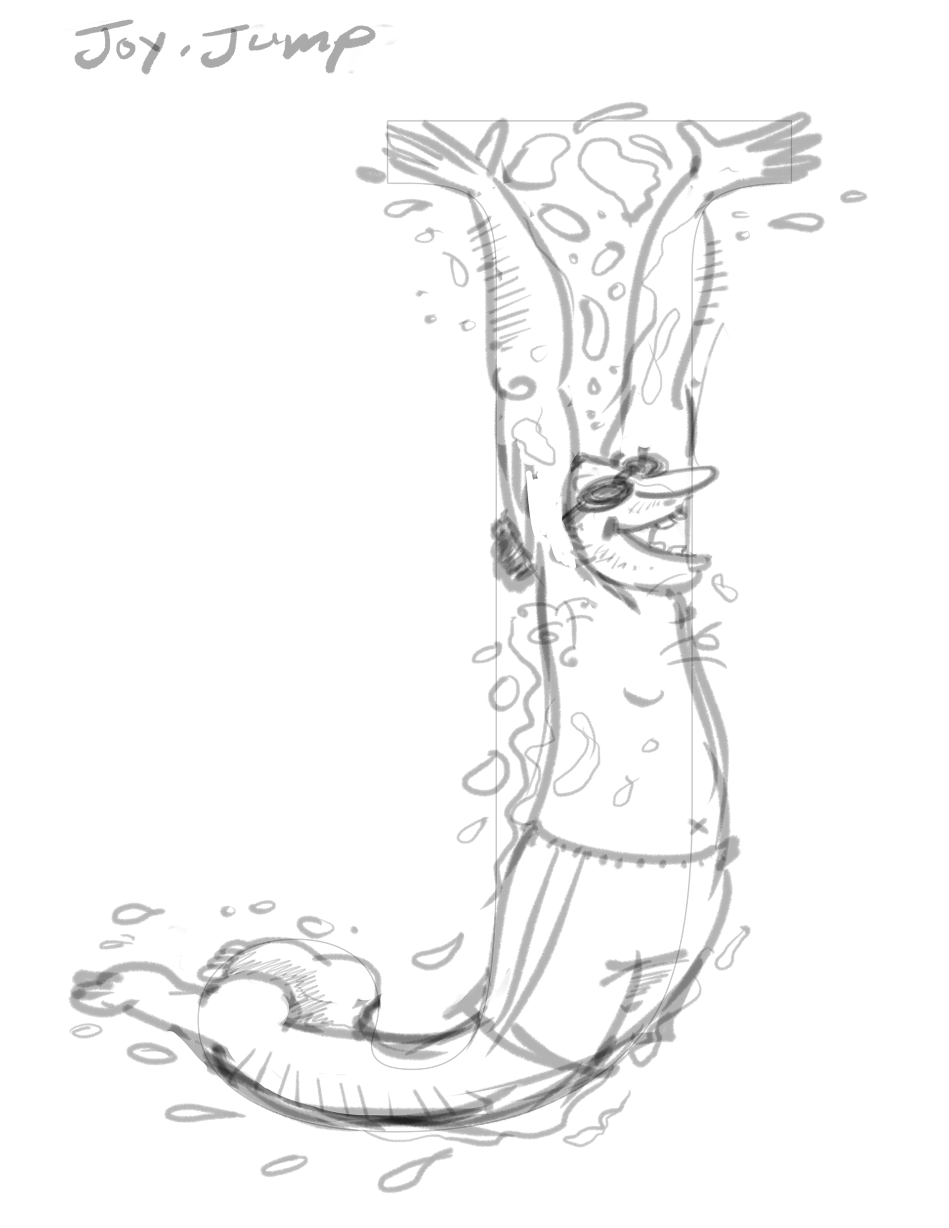
GOOD VS EVIL
TYPEFACES, BRAINSTORMING, & INITIAL THOUGHTS
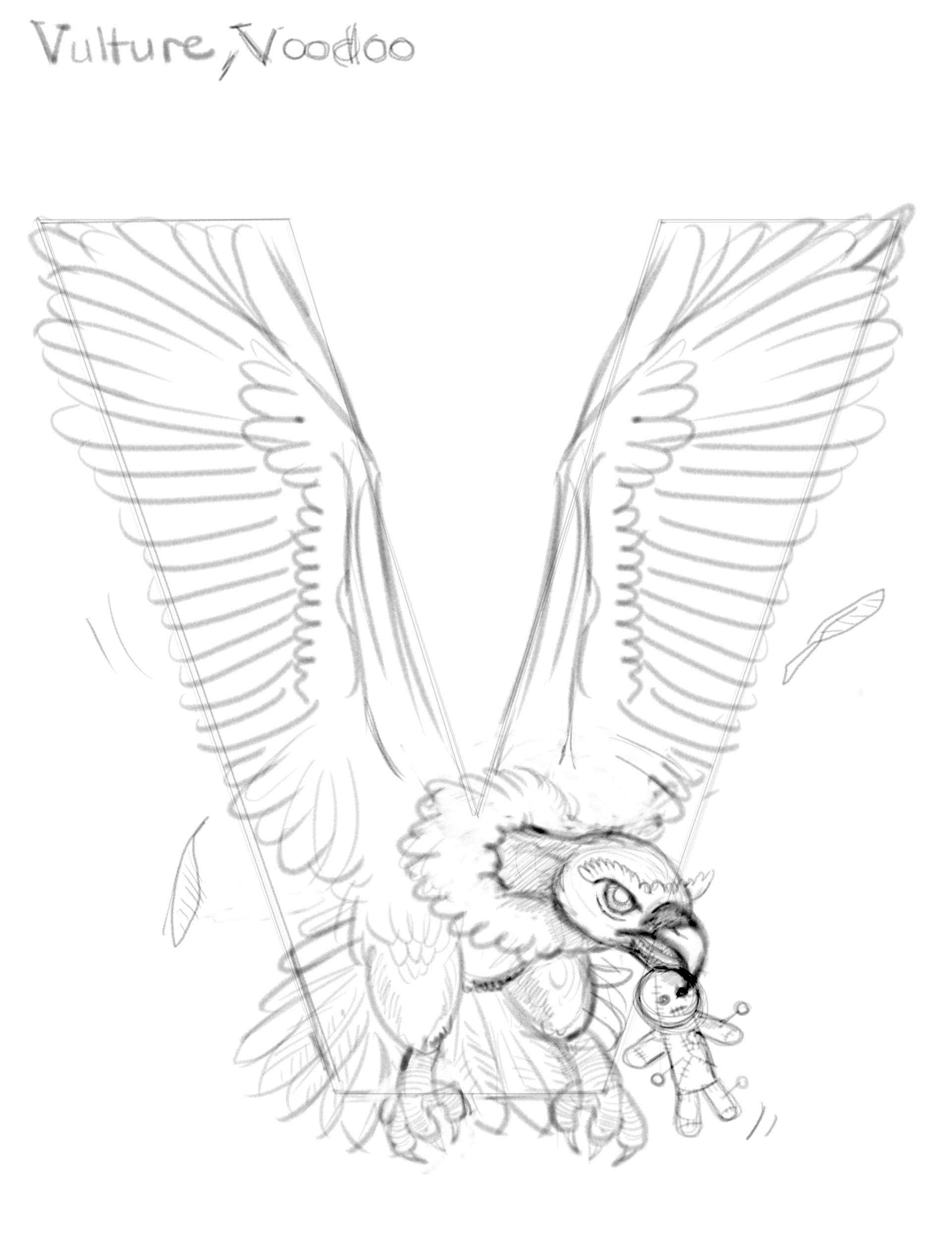
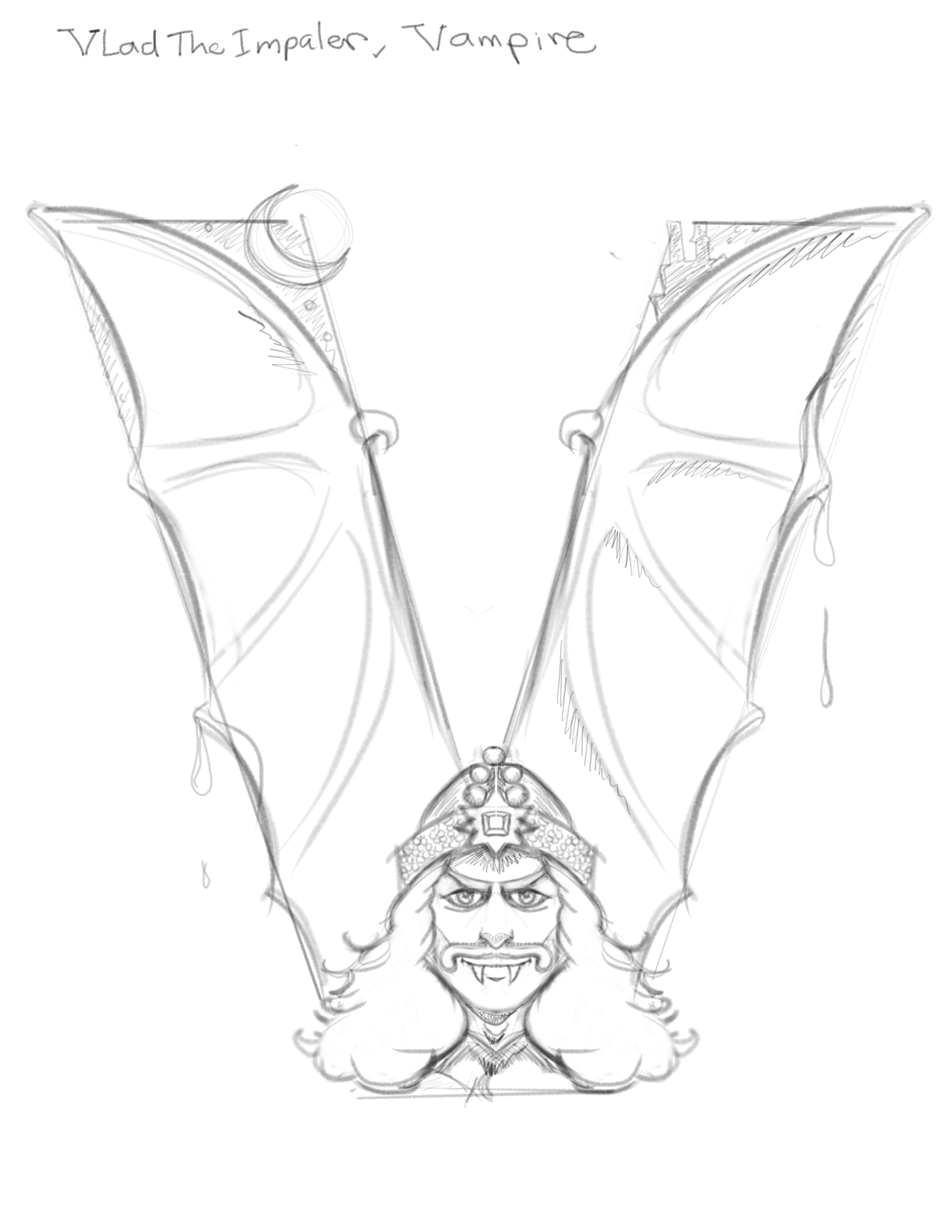
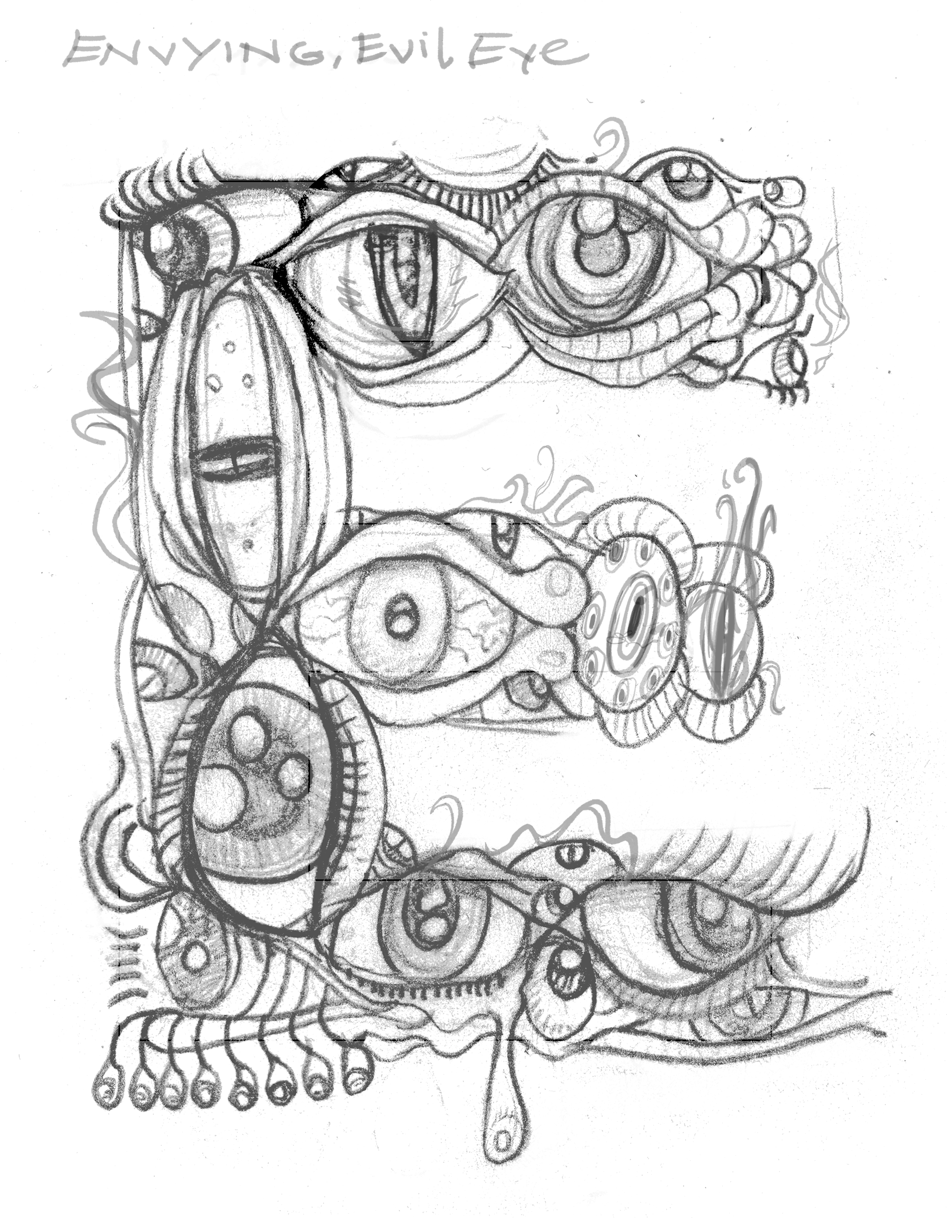
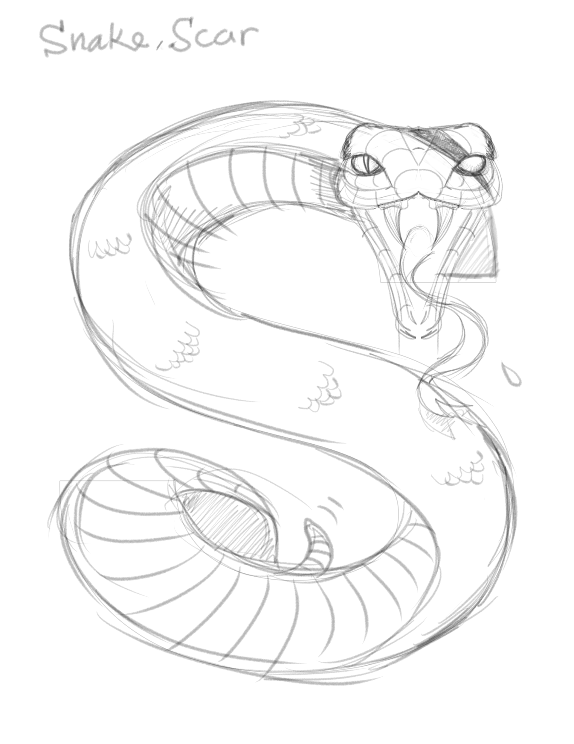
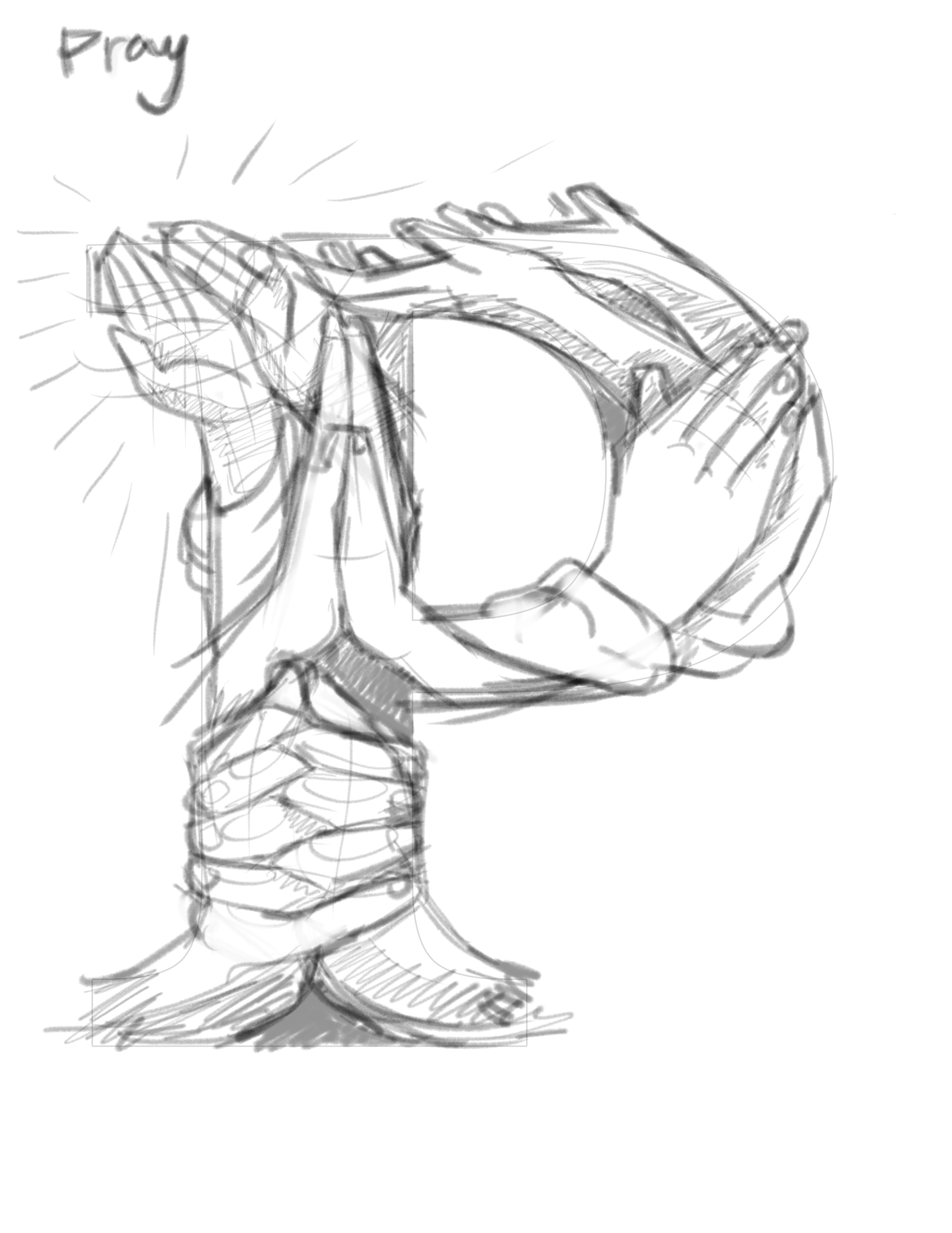
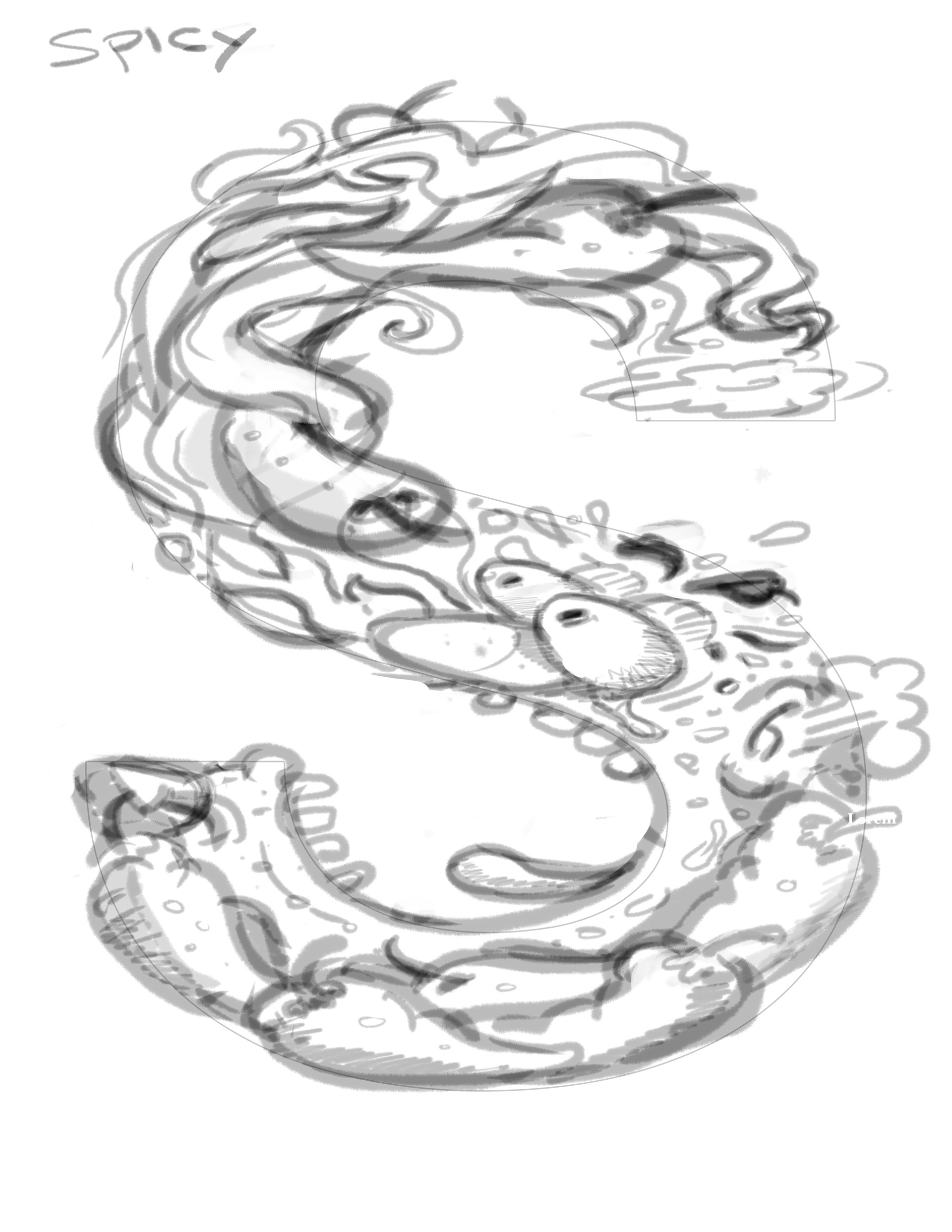
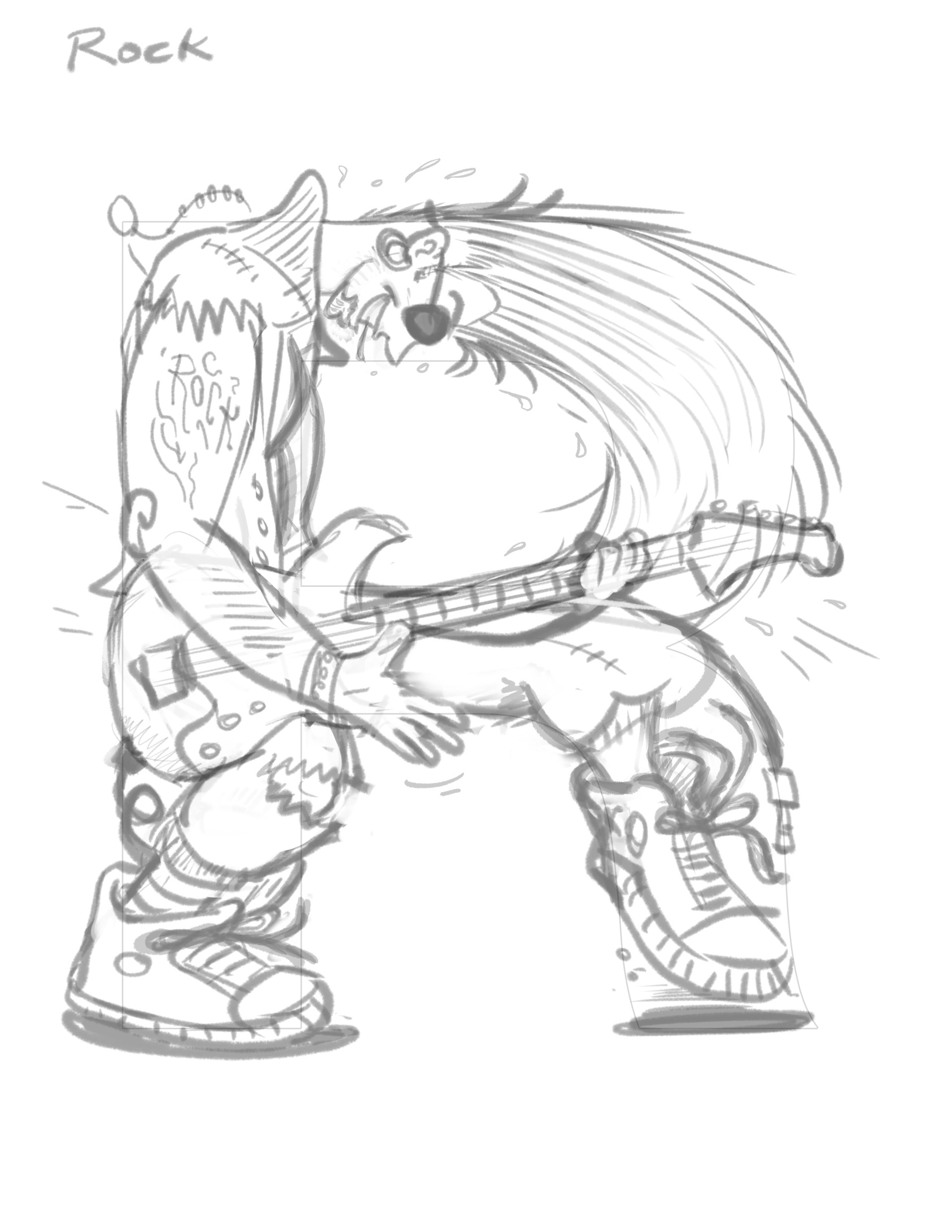
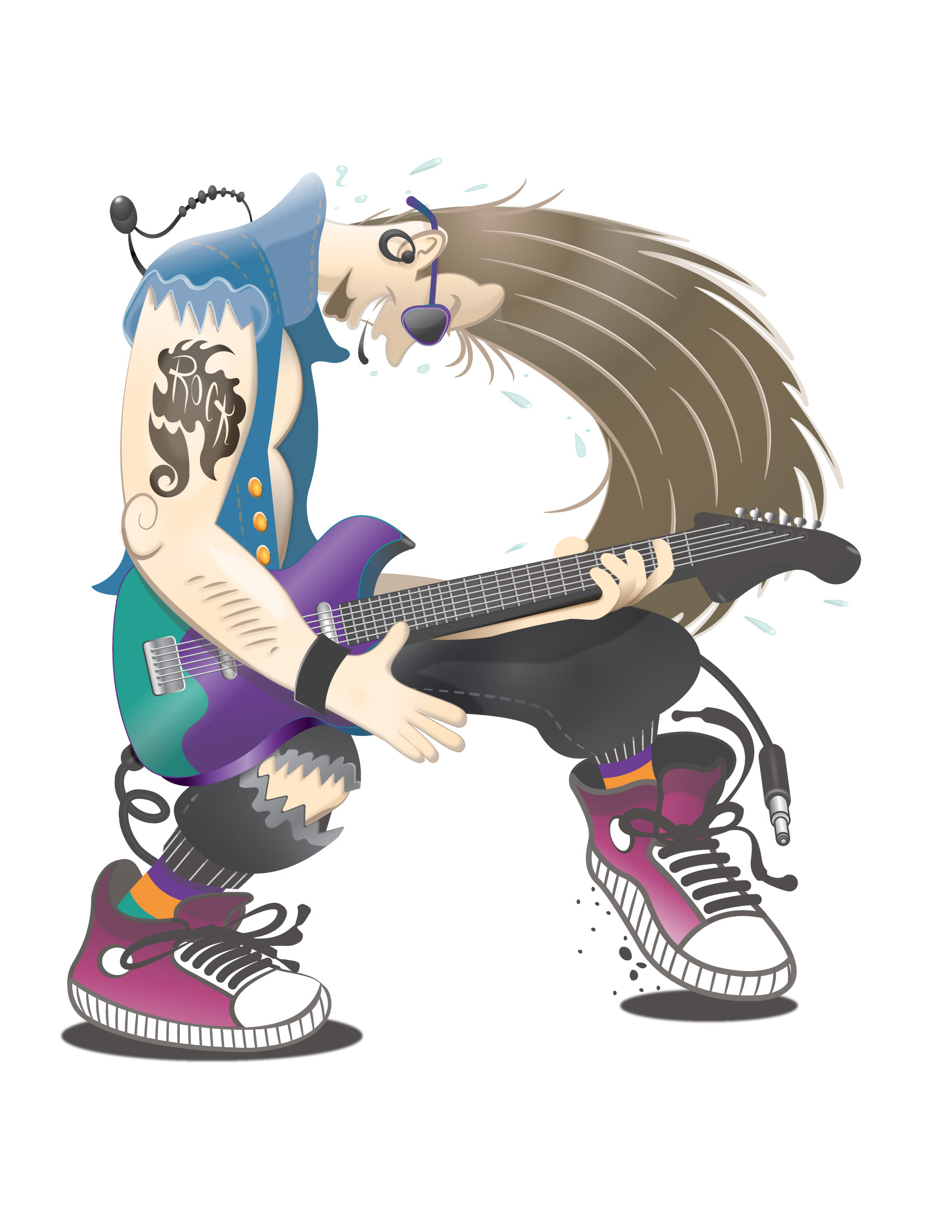
The typeface I have chosen was Helvetica, for some letters, I used Baskerville like letter P because I wanted the serifs to be part of my concept in those particular drawings. In my sketches I made a theme themed I called it “Good vs Evil”.
SKETCHES OF GOOD
NOT TOO GOOD, NOT TOO BAD!
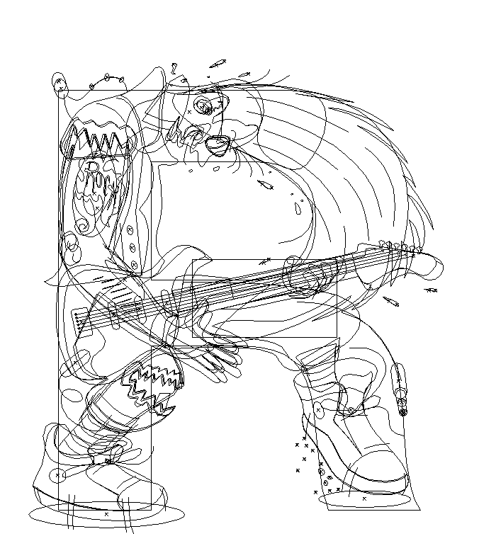
VECTOR ILLUSTRATION
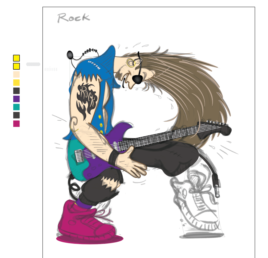
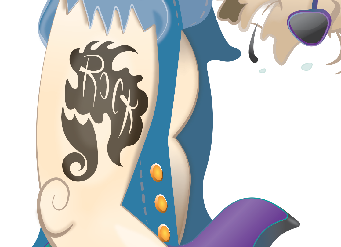
DETAILS


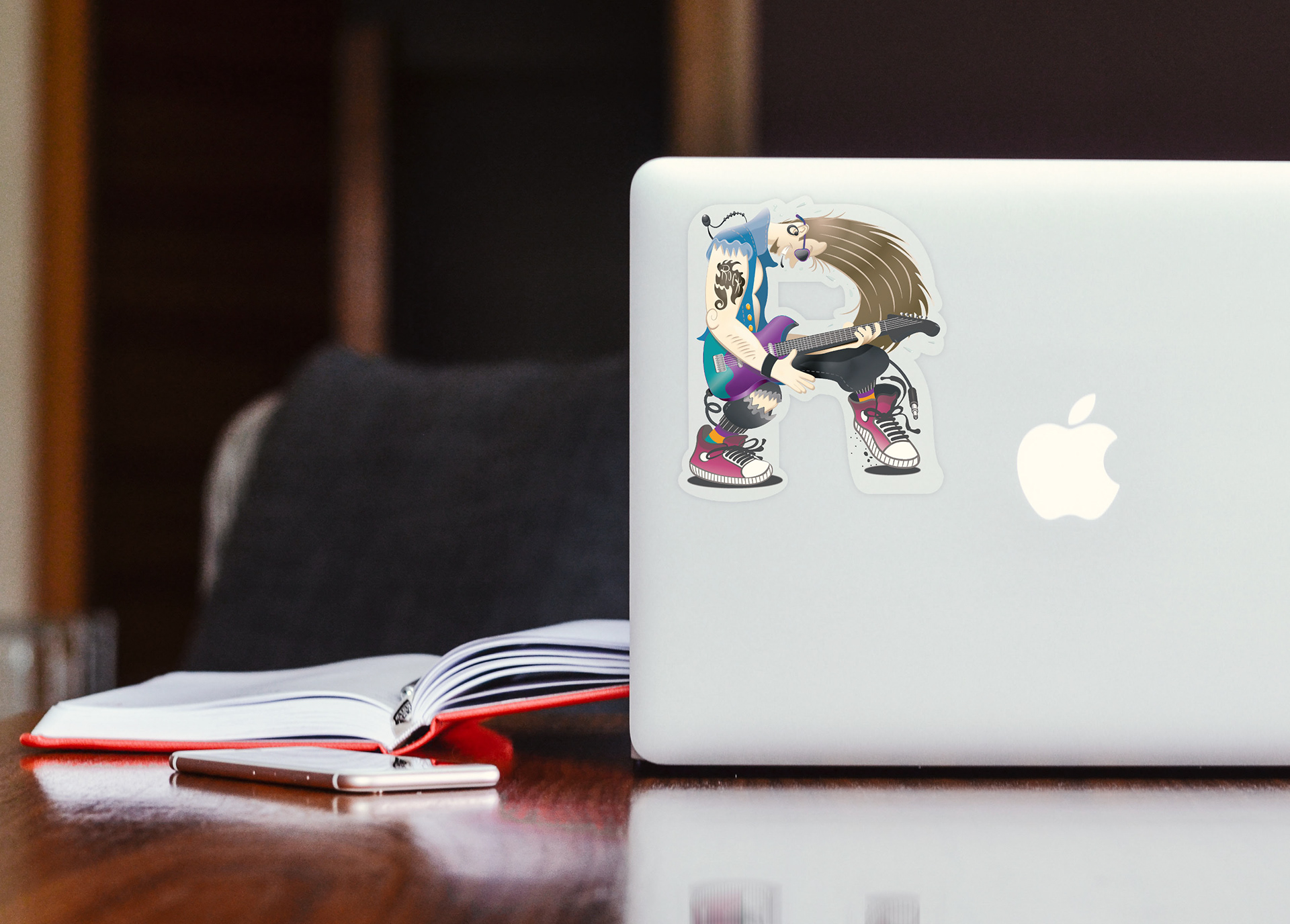
MOCKUP:
THANKS!
Firas Ota Bachi © 2021