Client: Liberty University (Professor. Hutchings: History of Graphic Design)
Work: Branding, logo and stationery design, & Essay inspired by the timeless style of Saul Bass in the 80s
Firas Bachi © February 2022


FREE ARTISTS BEHIND BARS:
LOGO & STATIONERY DESIGN
ESSAY & INSPIRATION
Timeless Saul Bass’s Simplicity & Symbolism
By Firas Otabachi

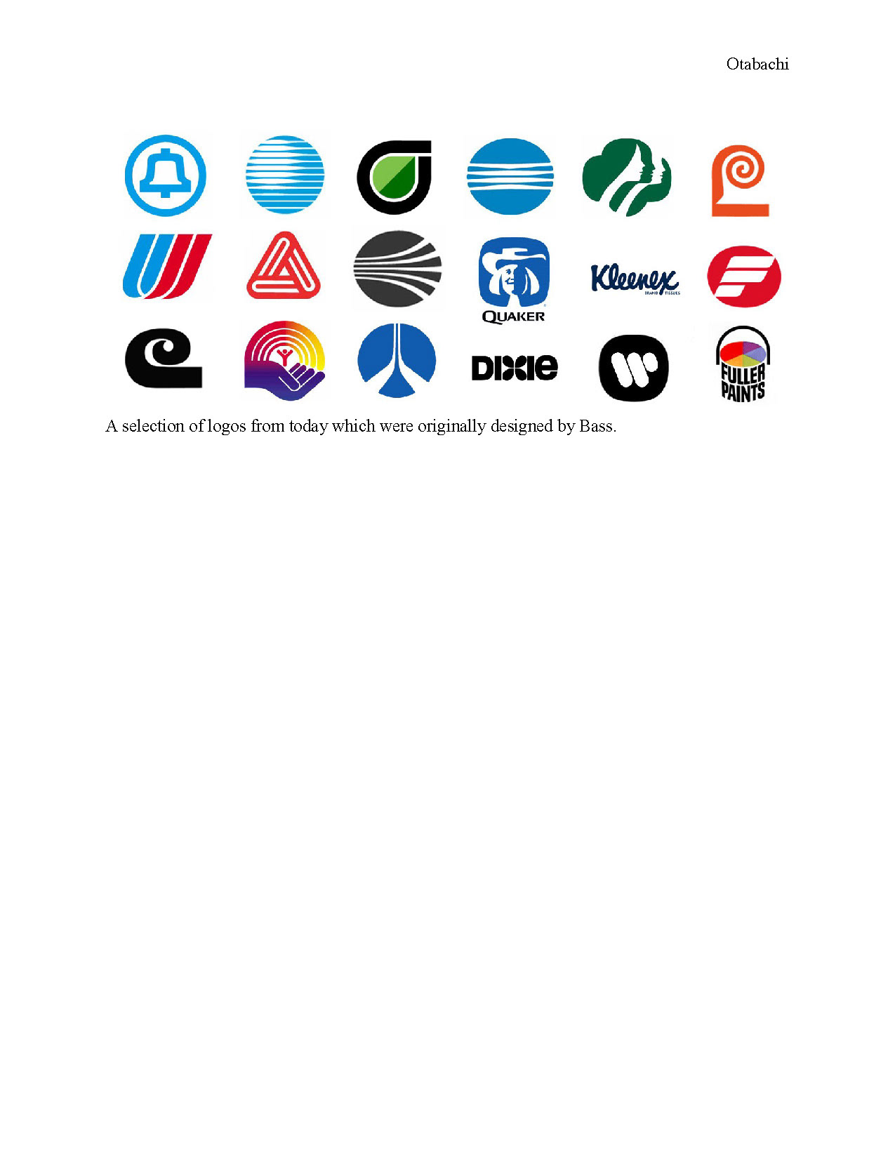
For many decades, AT&T (American Telephone and Telegraph Company) the telecommunication giant, has been known as the world's largest telecommunications company and the largest provider of mobile telephone services in the U.S. A simple logo with distinctive treatment of a striped, blue globe with horizontal lines covering that globe. AT&T emblem and logotype as a lockup was designed in 1983 and served until 2015 when it was uplifted by a studio called Interbrand. What changed the Bell emblem that represented the phone inventor to be a blue globe at a first place? Here I’ll be discussing the creation of AT&T genius logo, and the designer behind designing hindered of timeless corporate logos like Quaker, United Airlines, Minolta, Kleenex and others, and iconic movie posters like the Shining, Vertigo, graphic designs that continued to be part of the pop culture and contributed to making today’s visual communication foundations.
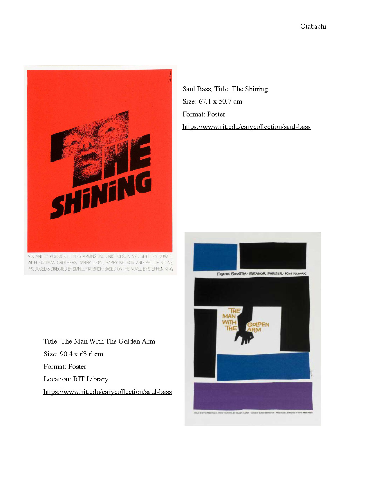
Besides being one of the best graphic designers and corporate logos of the last century and winning Academy Award for his exquisite graphic designing, Saul Bass was popular for designing of a multitude of motion picture title sequences, classic movie posters for almost half a century. Bass is an academy award-winning filmmaker, to name a few of his famous title sequences and posters that include iconic movies such as: The man with the Golden Arm 1955. North by Northwest 1959. And Psycho 1960. The shining, The Man with the Golden Arm 1955, Vertigo 1958, Anatomy of a murder 1959.

Saul Bass (1920-1996) was born in the Bronx, New York, on May 8, 1920, in the household of Eastern European Jewish immigrants. He grew up with a love to drawing. Studied at Art Students League and at Brooklyn College, attending night classes getting influenced by the famous Hungarian-born designer György Kepes and the Russian Constructivist and Bauhaus school. Upon completion of his studies, he worked as a freelancer for several advertising companies and agencies, including the illustrious Warner Bros, then he moved to LA in 1946 to proceed his graphic design career.
Graphic Designer in Hollywood
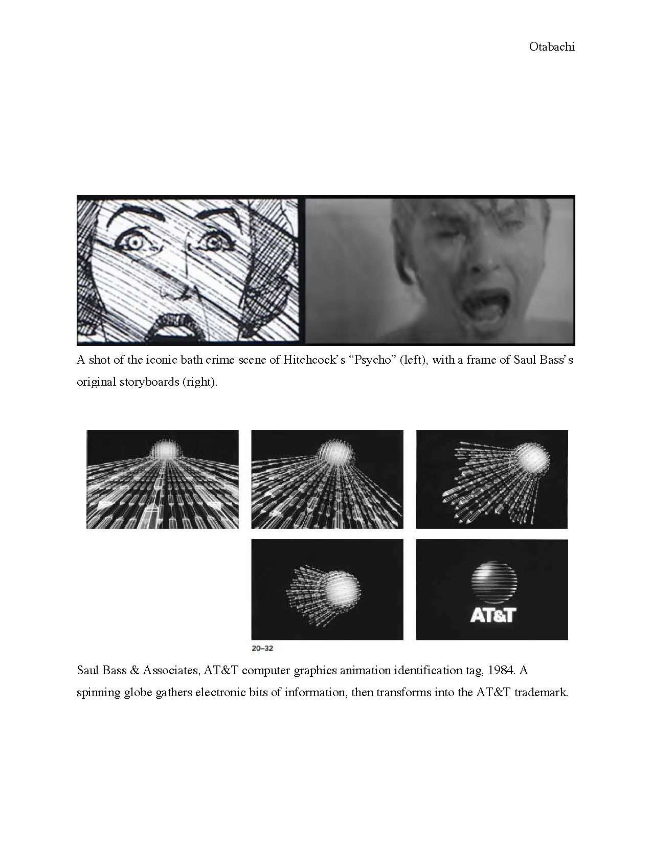
Bass took up some Hollywood projects in Los Angeles like printing for promotional purposes and established his private firm as Saul Bass & Associates. But his big career jump was through a commission from the film director Otto Preminger to create the titling sequences for “Carmen Jones.” then many other movies until came one film that “firmly established his reputation”, Preminger’s “The Man with the Golden Arm,” with its “still dazzling sequences and memorable cutout image of the addict’s arm”. That was the time when Bass’s “edgy and graphically arresting touch” started to shine. Bass developed iconic, influential, and noteworthy title sequences employing distinguished kinetic typography for the Hitchcock’s most popular films, including North by Northwest (1959), Vertigo (1958) and Psycho (1960). He was the first to introduce this technique in Hollywood films which previously employed static titles. Besides creating the storyboards of famous movies like “Psycho”, Bass claimed to have directed Janet Leigh’s shower scene sequence. Other great film that he contributed to like Kubrick’s “Spartacus” and “The Shining”; Scorsese’s “Goodfellas” and “Casino”; and Speilberg’s “Schindler’s List.” 

Iconic and Timeless
However, it's been observed that Bass’s iconic logo designs gone largely unchanged. On his YouTube channel, discussing Saul Basse’s timeless logos and poster design, Gareth David on a video titled “AT&T Logo, Saul Bass, Logo design & Designer review “argued that the average lifespan of a Saul Bass logo is 34 years. Examples include: The United Way logo that was designed in 1972 was refined slightly in 2004. While The Girl Scouts logo designed in 1978 and refined slightly in 2010. And The Kleenex logo modified slightly from Bass's design in 2007 and the Dixie logo designed in 1969 to be tweaked and modified slightly in 2016.
Saul Bass understood this concept of timelessness and the logo lifespan and applied it throughout his designs, the 'Bell logo' served from 1969 to become a globe in 1983. Horizonal lines would come to represent lines that covered the globe suggesting worldwide communication. That logo would become —according to Gareth David —known as “the death star logo”.


Simple Symbolism
Technically speaking, the simplicity of Bass’s emblem with a blue circle with Knock-out horizontal lines was remarkable, the AT&T logo is essentially a combination mark, it includes two visual elements the prominent logomark and a logotype, in this case more specifically a lettermark because it's an acronym. The bold monolithic Sans Serif typeface was developed in the previous logo version. A 100% cyan blue color was kept in the 1983 version. Over 40 years the logo would be modified and refined slightly with twist to the angle and dimension.
To quote Saul Bass speaking about his logo design process:
“The symbol creates the uniqueness in the mark. So the lettering in the logotype can remain clear and easy to read.  The symbol becomes a flag, by itself the logotype is just another word in a sea of words but combined the symbol serve as a focal point directing attention to the name.”
Although the logo would become refined with a change of typeface and more curvature lines in 2015, AT&T logo is still reminiscent of Saul Bass's design back in 1983. Today it is common for the logotype element to appear standard alone or as a lockup with the lettermark. With a strong visual narrative, movement and direction elegant and simple execution. Each of Saul Bass’s designs is very distinct, memorable and feels timeless in a particular way to its audience to celebrate his legacy. Saul Bass's work has proven that simplicity along with strong visual narrative and originality is the formula for timeless logos, Gareth David argued.
Saul Bass’s most memorable quote was, “Symbolize and summarize.” Though his symbolism and summarization mastery manifested in his simplicity and symbolism in his logo design and corporate identity career, through his work for some of the biggest corporations such as AT&T, and United Airlines, it provided them with logo that were symbols and trade-marks that gained the most memorability and brand recognition of the 20th century along with many American designers such as Paul Rand, Lester Beall, and design firms such as Lippincott & Margules and Chermayeff & Geismar, who embraced corporate visual identification as a major design activity. Meggs wrote:
“Saul Bass’s mastery of elemental form can be seen in the iconic and widely imitated trademarks produced by his firm Saul Bass & Associates, later renamed Saul Bass/Herb Yeager & Associates. Bass believed a trademark must be readily understood yet possess elements of metaphor and ambiguity that will attract the viewer again and again. Many Bass trademarks, such as the mark for Minolta, became important cultural icons. Within two years after Bass redesigned the Bell Telephone System trademark, public recognition of the symbol rose from 71 percent to more than 90 percent. After the AT&T long distance telephone network was split from the local Bell system telephone companies in 1984, Bass designed a new mark to reposition the firm as “a global communications company” rather than “the national telephone system,” with information bits circling the globe. This concept was expressed by making computer-graphics animation the identification tag for AT&T television commercials”


Work Cited:
“Saul Bass”, Graphic Design Archive, Cary Graphic Arts Collection, Rochester Institute of Technology website, https://www.rit.edu/carycollection/saul-bass

David, Gareth, “AT&T Logo, Saul Bass,  Logo design & Designer review” Gareth David Studio YouTube Channel, Mar 22, 2017 https://www.youtube.com/watch?v=8BzLijw5h5E
“Saul Bass”, Famous Graphic Designers website, https://www.famousgraphicdesigners.org/saul-bass
Meggs, Philip B, Alston W. Purvis, and Philip B. Meggs. Meggs' History of Graphic Design. , 2006. Print.
Back to Top