Project: Monochromatic Wall Art (Reincarnation Portrait)
Work: A-Z, Concept, research, sketching, illustration, design
Tools: Pencil, Wacom pen tablet, Adobe Photoshop, Adobe Illustrator
Liberty University, VA, USA
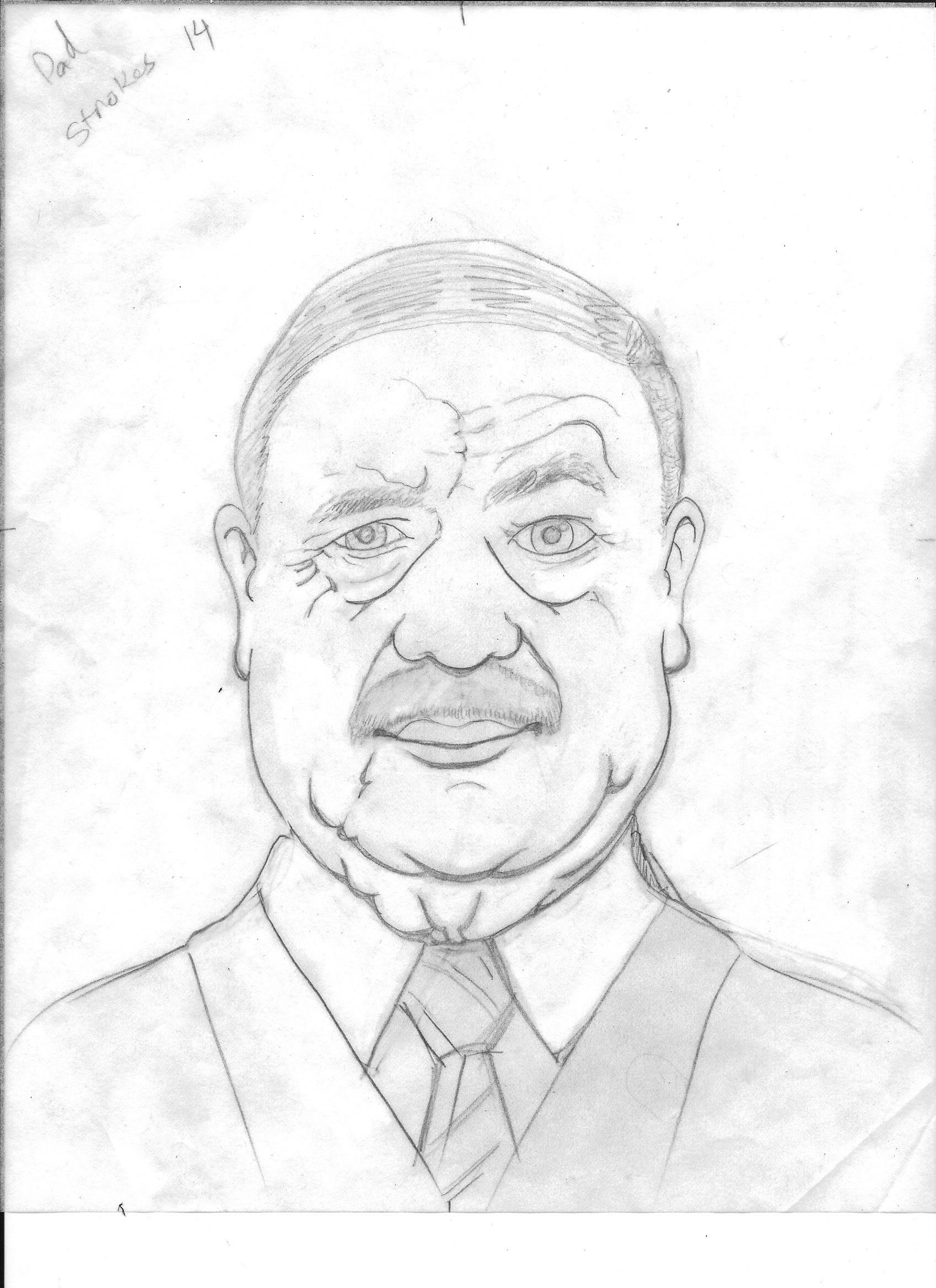
Models: Self, Father (Ameer Ota Bashi), son (Yazan Otabachi)
Firas Bachi ©2021
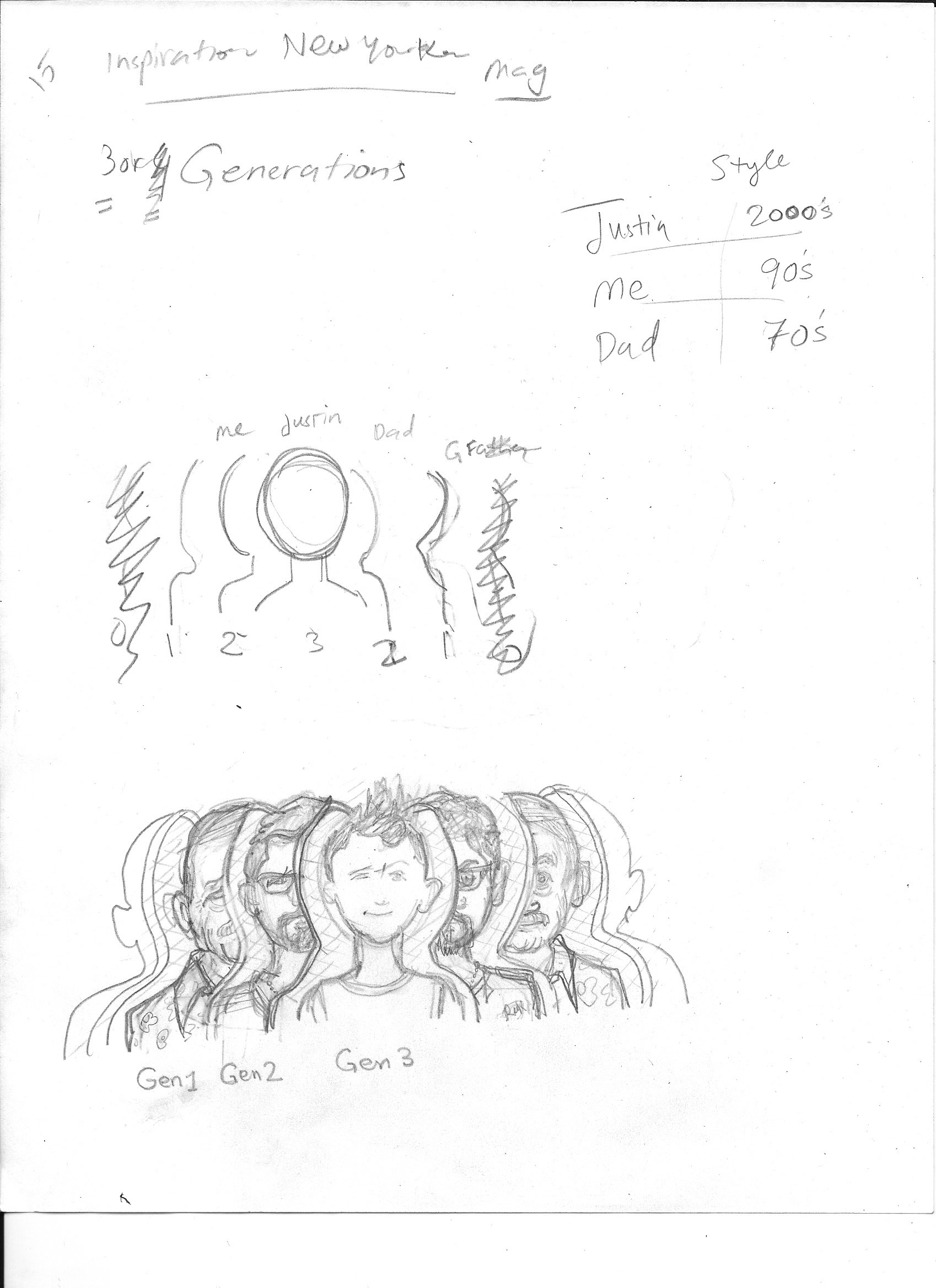
Reincarnation Portrait
A Monochromatic Study of Generational Identity
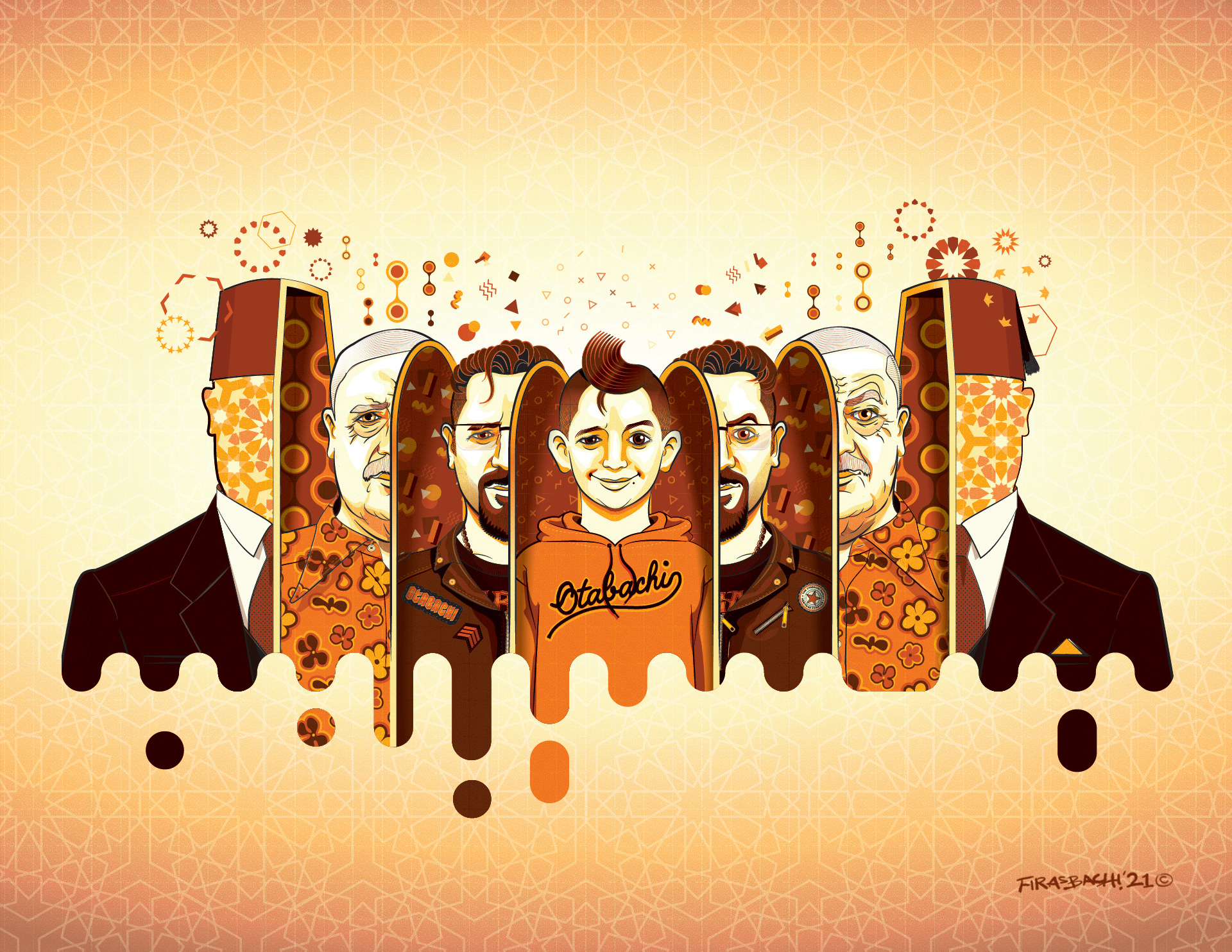
A conceptual portrait merging three generations into one unified identity.
This work explores how creativity and artistic instinct are passed down and continuously reshaped over time. By blending father, son, and grandson into a single composition, the piece reflects a shared lineage rather than separate individuals.
The monochromatic approach emphasizes form and expression, while patterns act as a visual thread — symbolizing inherited creativity and continuity across generations.
Not a literal reincarnation, but a rebirth of identity through time.
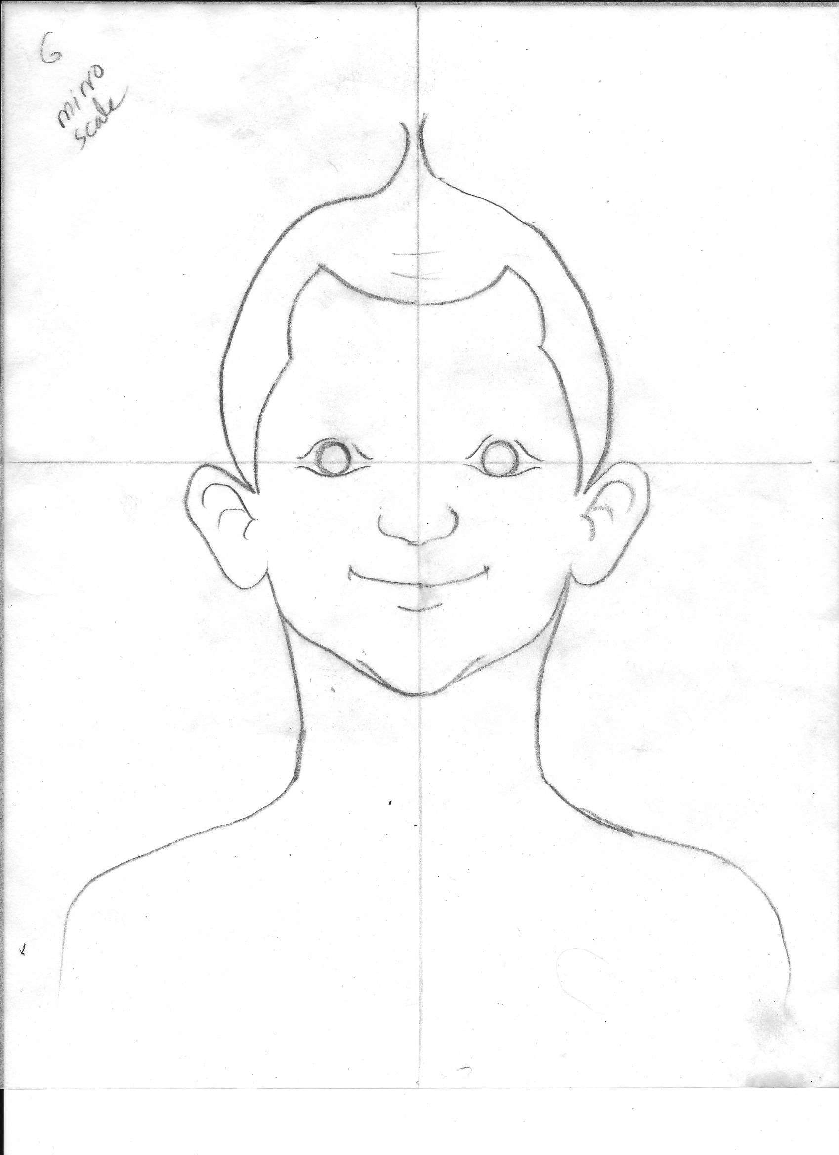
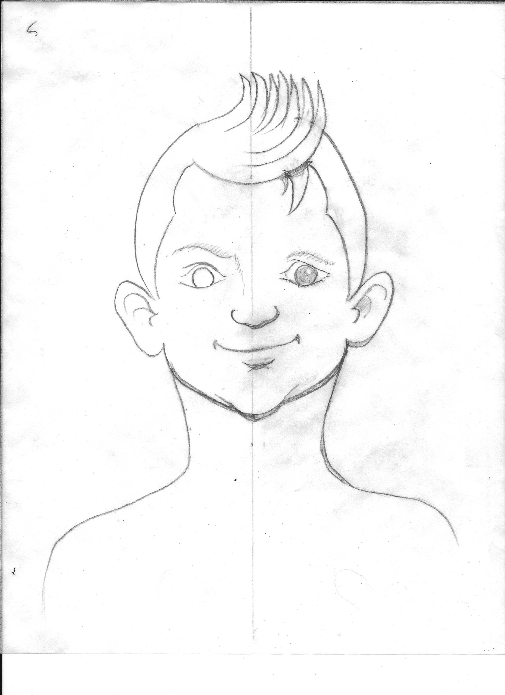
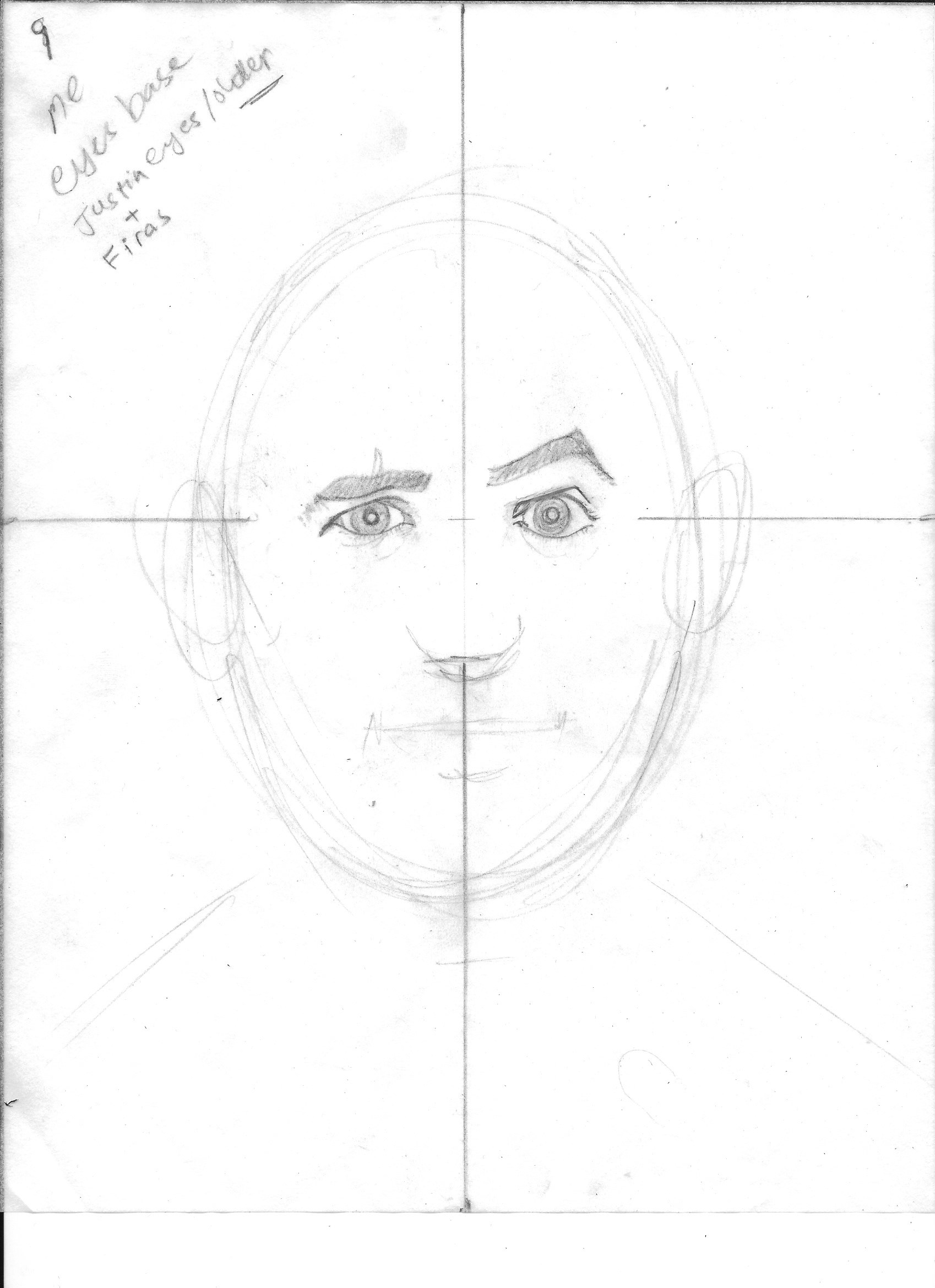
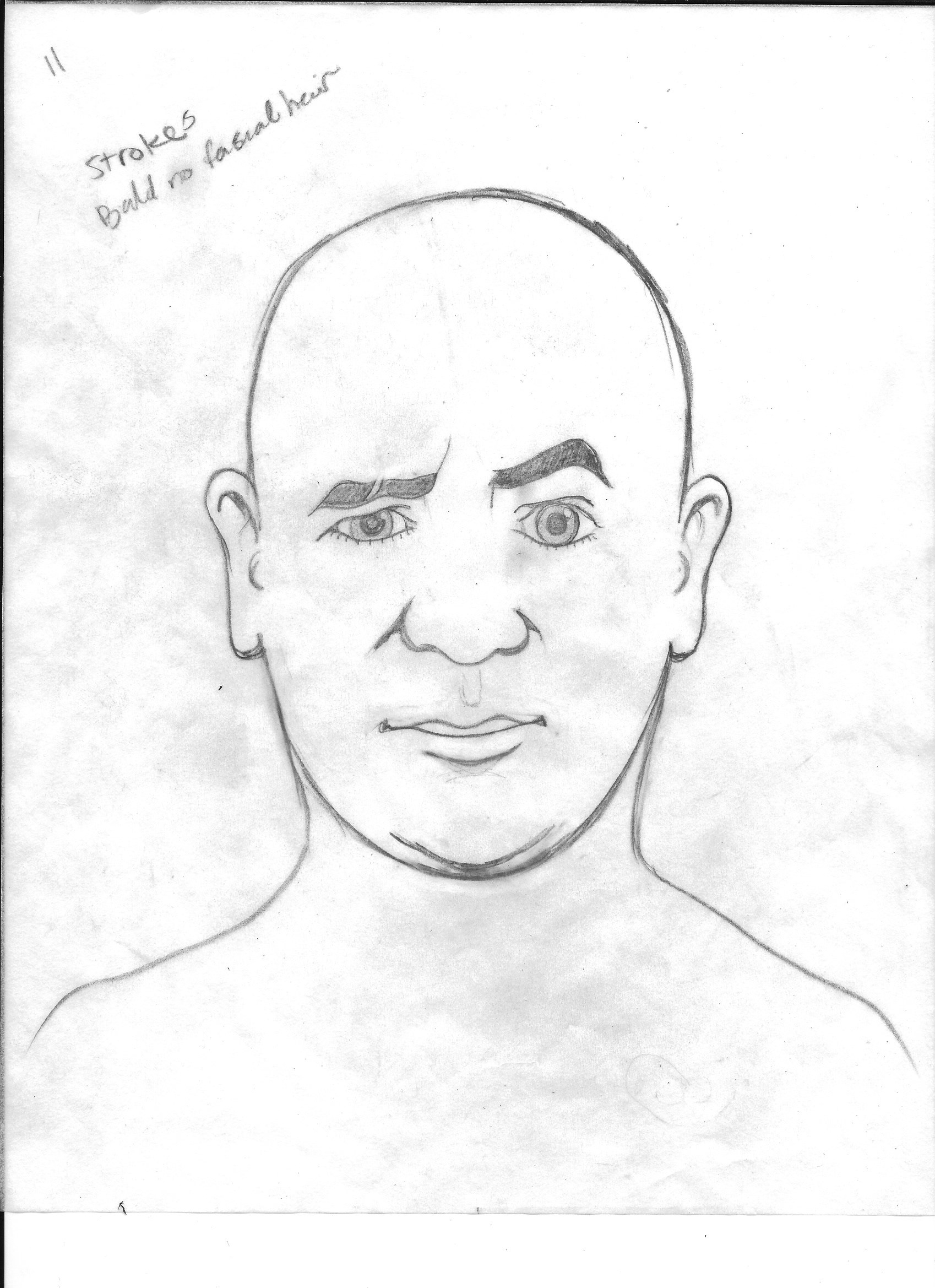
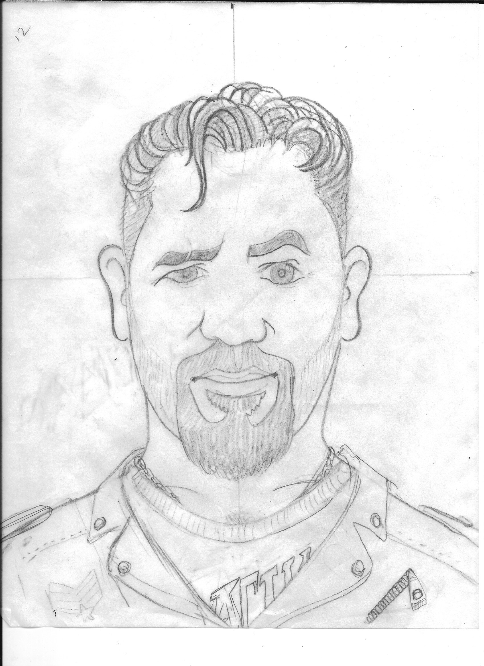
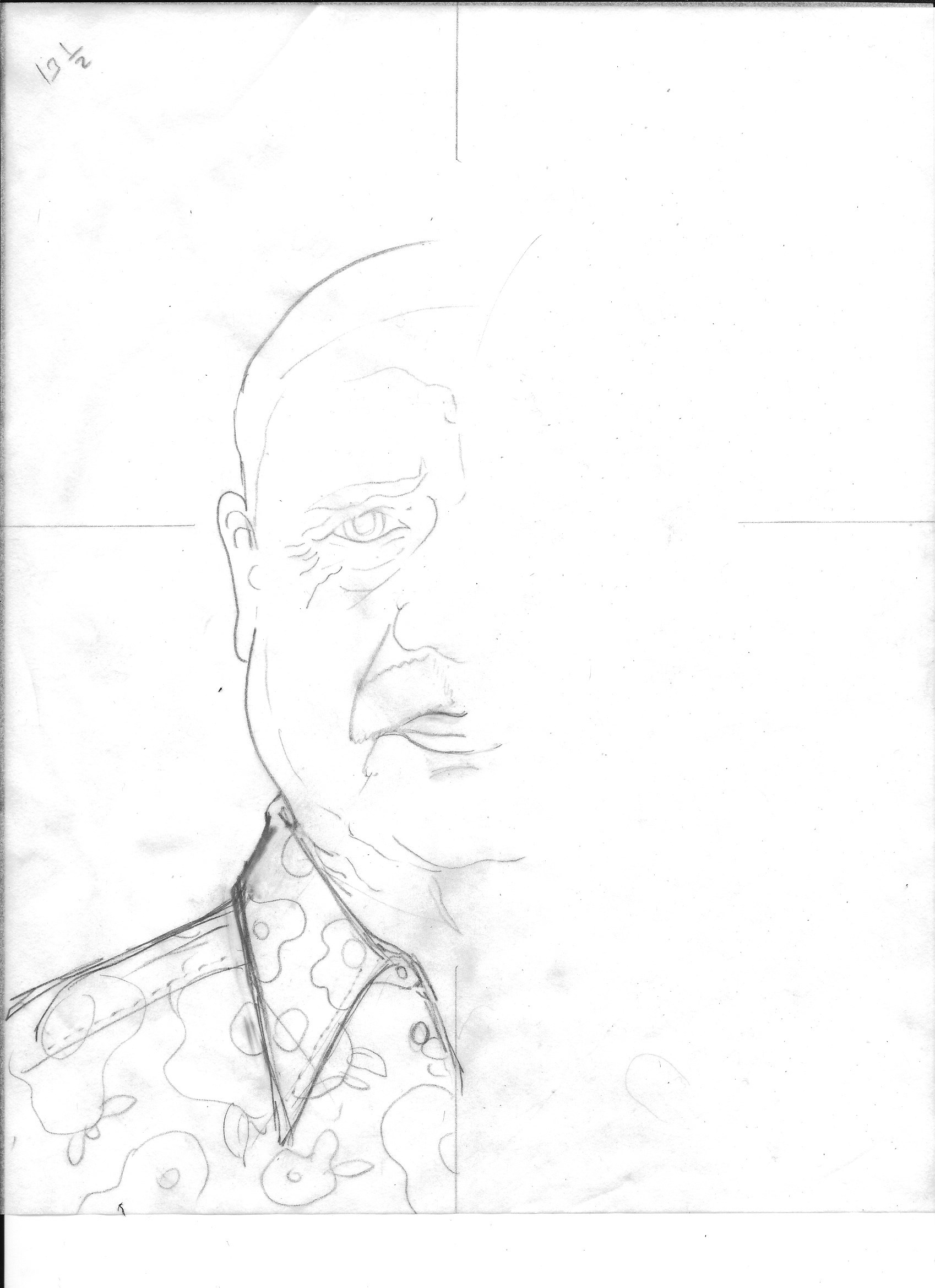
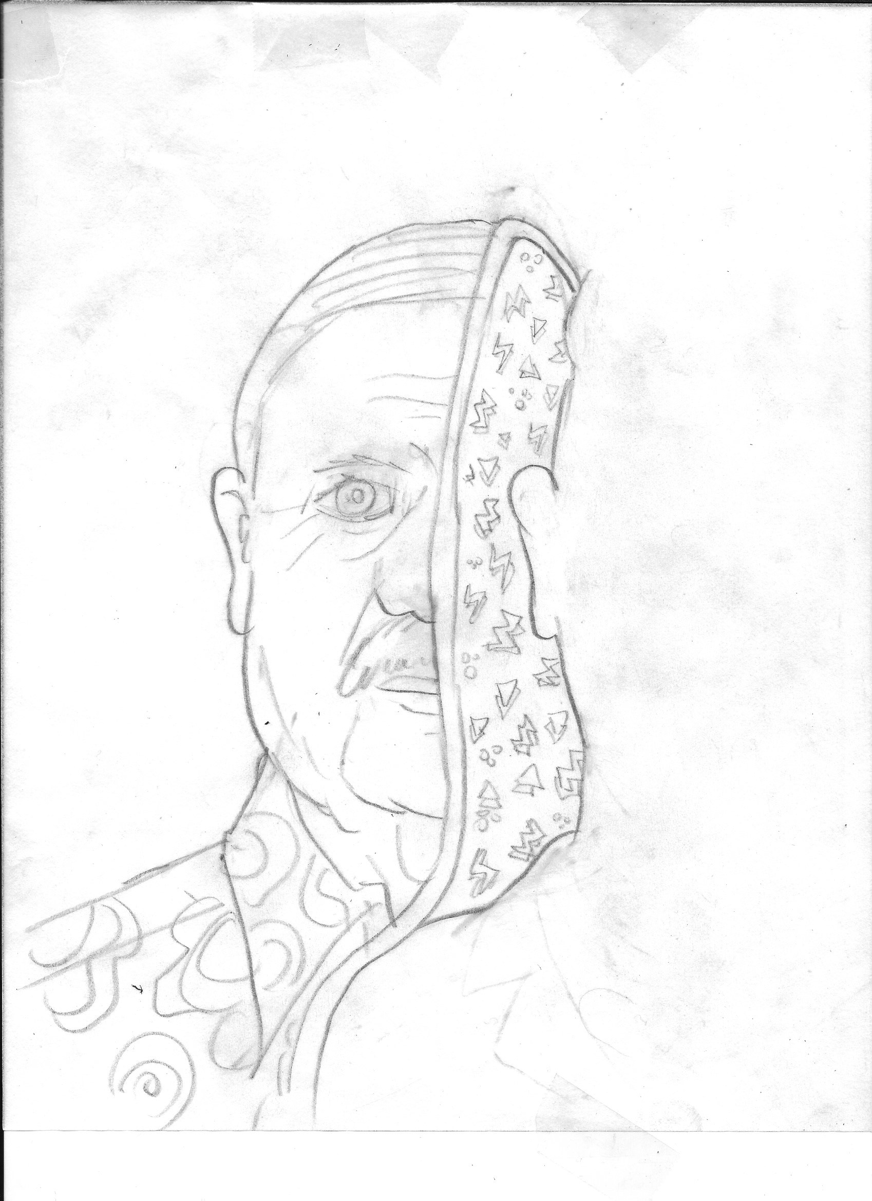
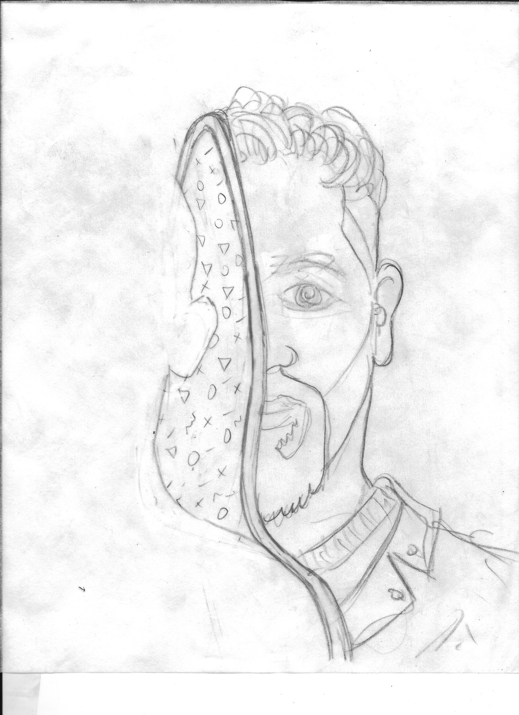
INITIAL SKETCHES
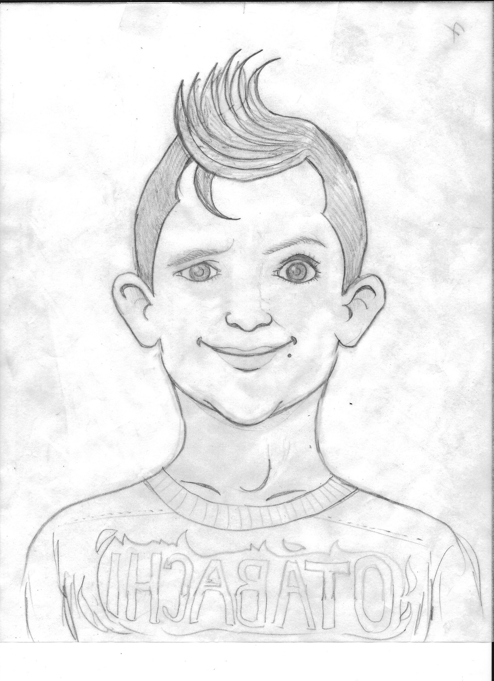
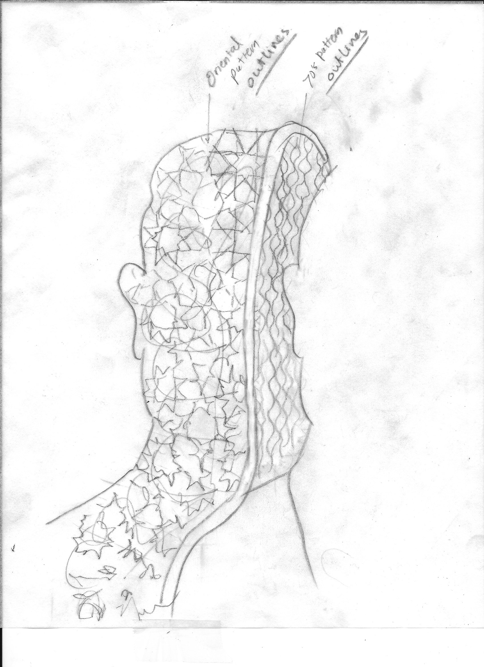
FINAL SKETCHE

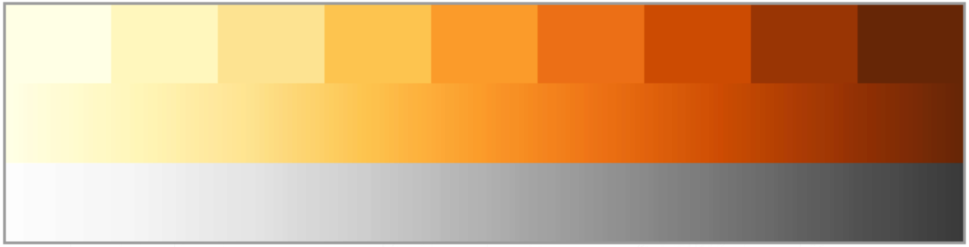
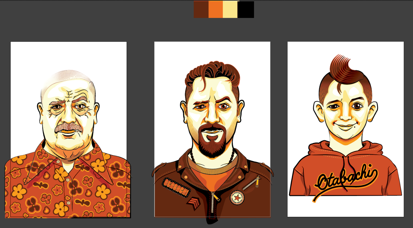
COLOR PALETTE
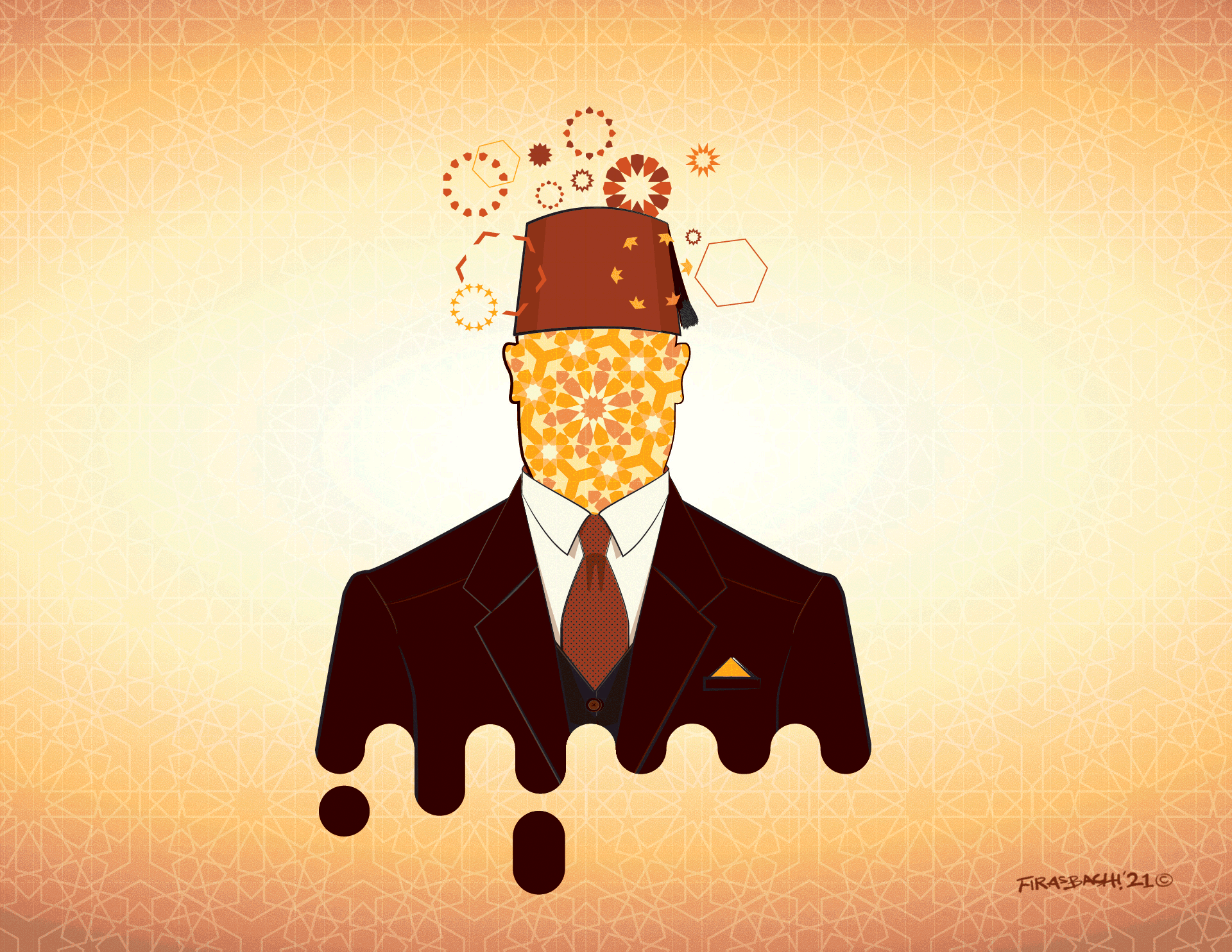
Funny is that in the first generation I had in my illustration it was my grandfather that I never met but I saw his art. He used to do those eastern traditional decorations for palaces and houses, it’s called “Ajami” or simply “Arabesque”, our family is very popular as one of the very few families that continued to do that kind of art back home, I’m afraid that after years of the war in Syria almost all of my family fled the country and may have stopped practicing this art/craft! So, I thought this art might express my mixed emotions of the love for my family, passion for that art, and grief to lose it, all at the same time.
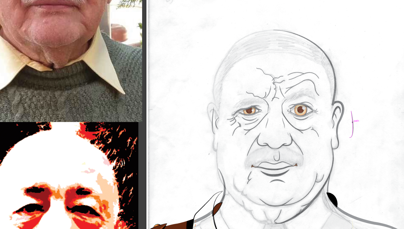
Since I don’t have a photo of my grandfather, I thought I still can give him a sort of a personality, so I dressed him in a 1930s outfit, off course there going to be a red “Fez” on his head, that was the hat of the literates back then in the area, basically with a stylish suit and tie, oh… and tissue in his pocket.
For the other people illustration, I was kind of decisive about what to do. I traced the sketches and created a custom outfit for each. The outfit design was a cool process I had fun researching and creating too, including all details of buttons and zippers, stitching, and accessories.
I used a high contrast level for coloring and I thought such kind of illustration would look great if contoured, and outlined with black, so I added black to the color palette after I tried the dark brown as a neutral color, and it didn’t work.
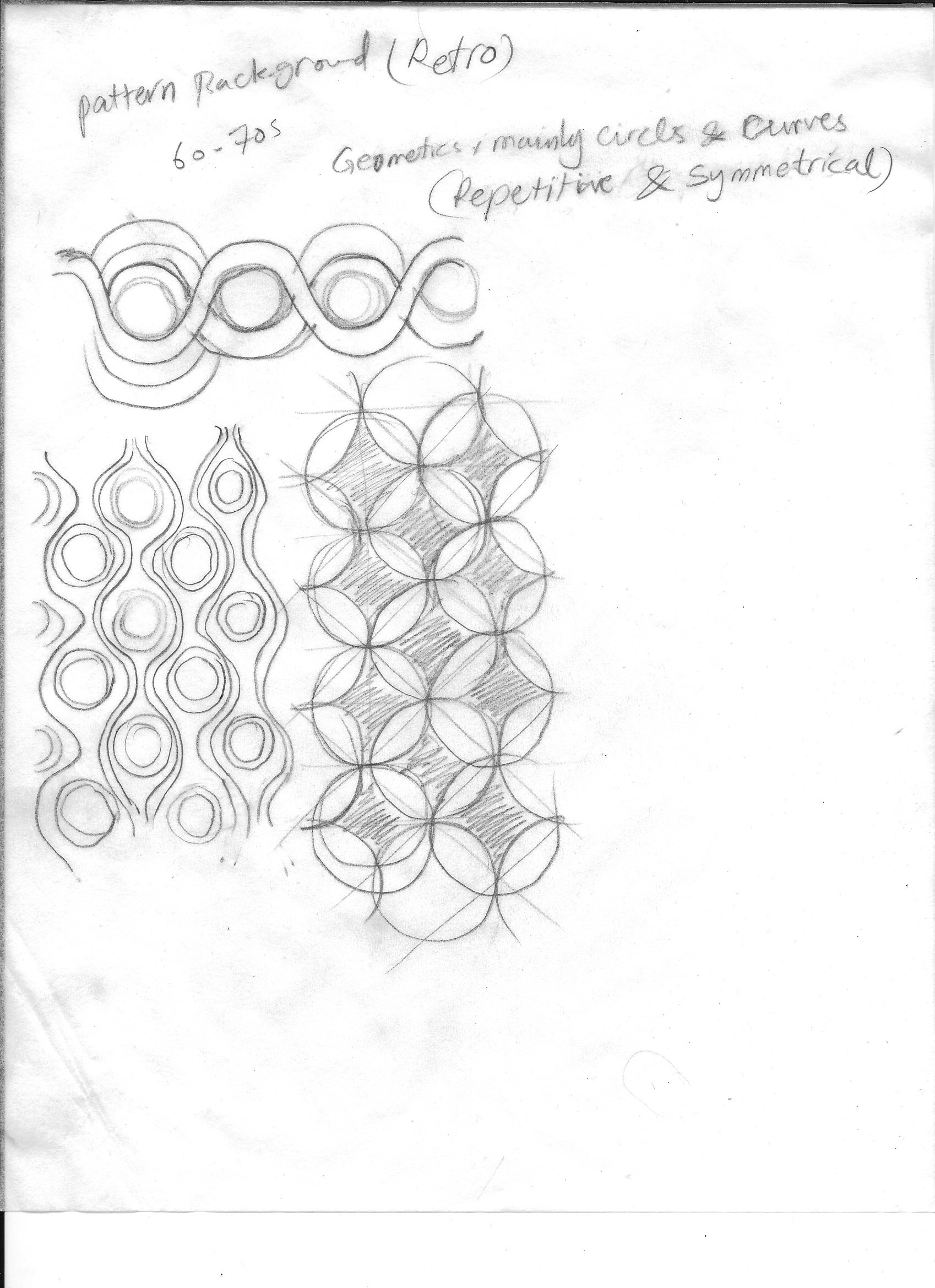
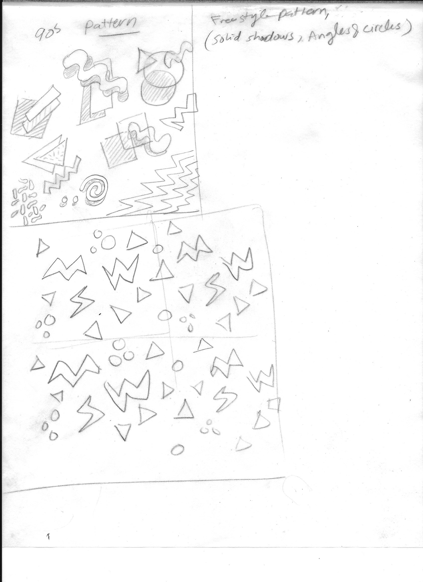
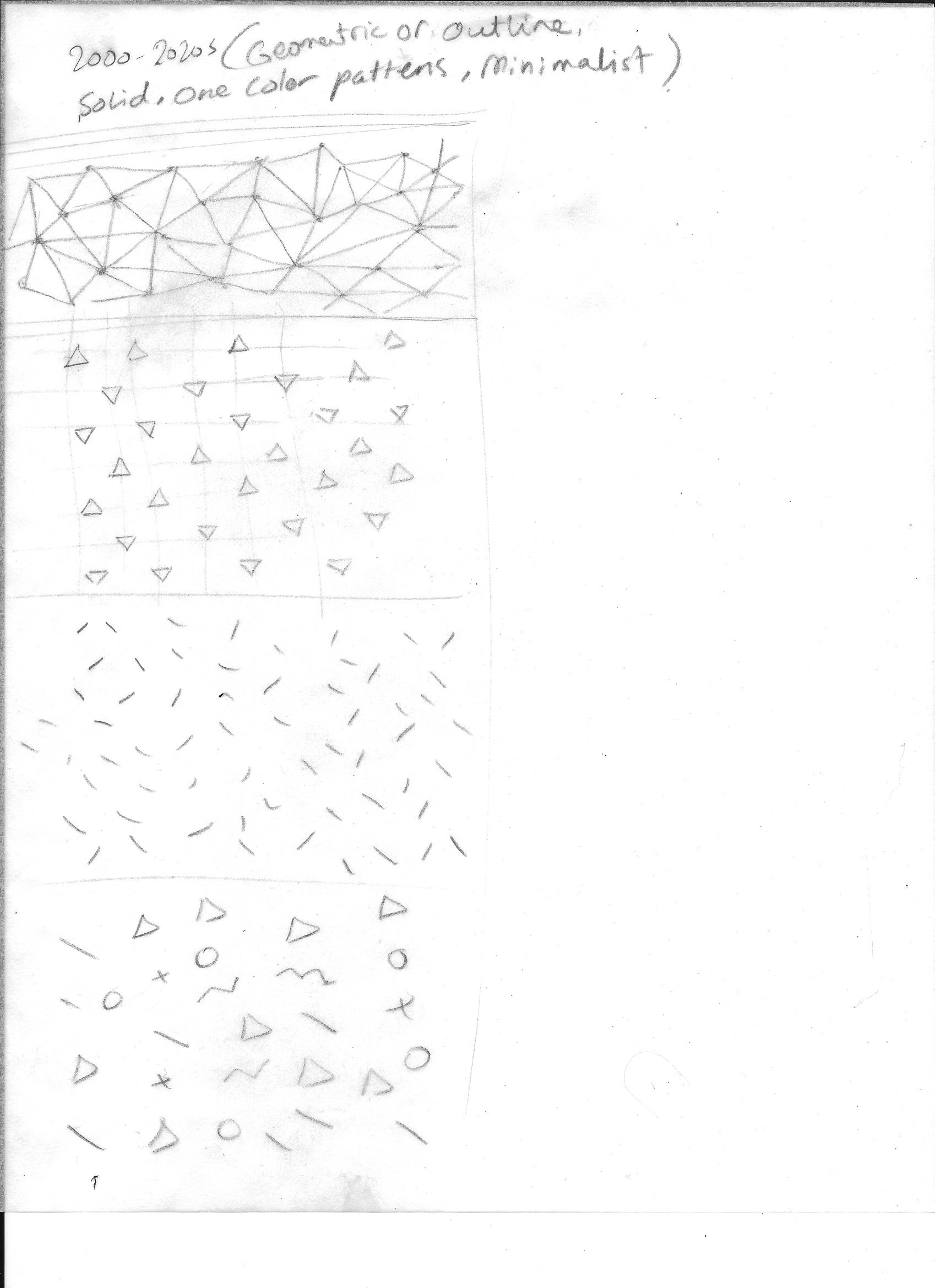
The Arabesque pattern was a real time-consuming process, but it turned out very good for this art I guess, I used it for the background and floating particles and the inside of the vertical cutout. Like I did for the other patterns I created as well, the 70s, the 90s, and the 2000s patterns.

Final Illustration
Although I seemed to be using different styles and treatments, most of them were there for a reason. I added the floating particles that were not in the sketch, I thought will complement the composition and would look like a transcendence of artistic or creative thoughts throughout the generations. Besides, the dripping effect finishes up the bottom of the people rather than showing them chopped off or adding other distracting elements at the bottom.
Wall Art Mockup
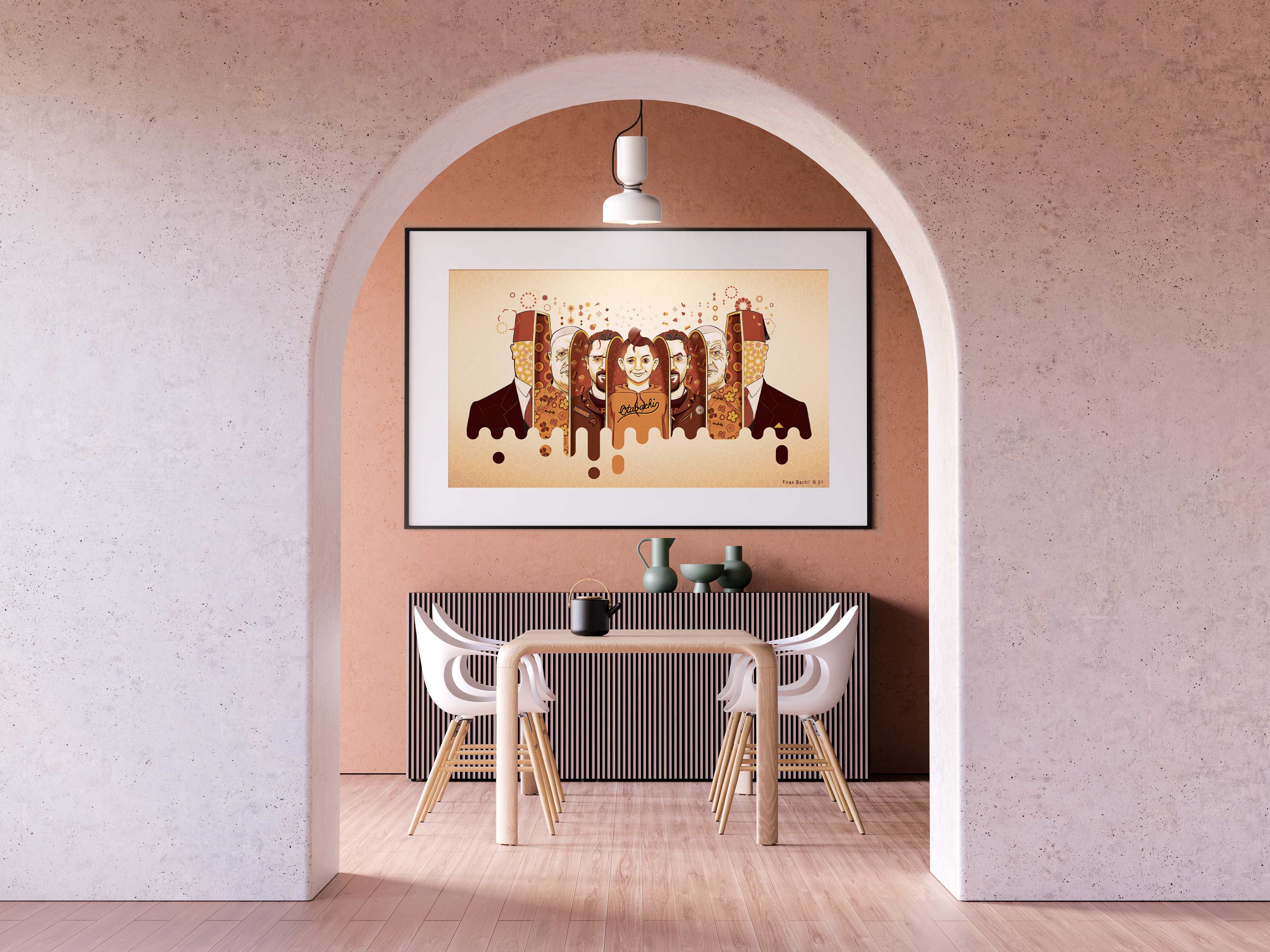
Image credits: Wall art Dining room background render #anthonyboydgraphics
Animated
Thanks!