Client: Liberty University, Professor: Brianna O'Neal
Master of Visual Communication Design
Work: A to Z, Concept, Research, Sketch, Illustration, Presentation
Year: 2021
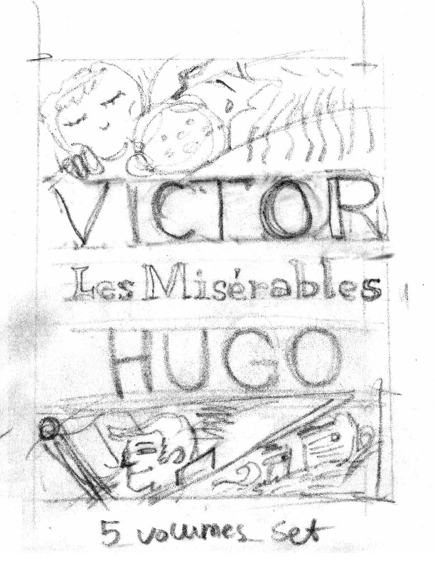
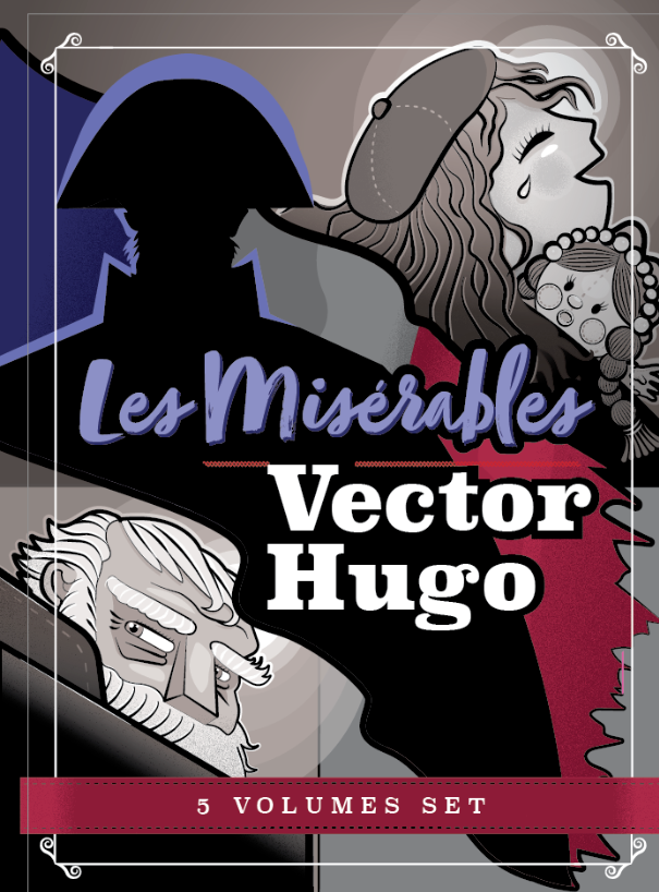
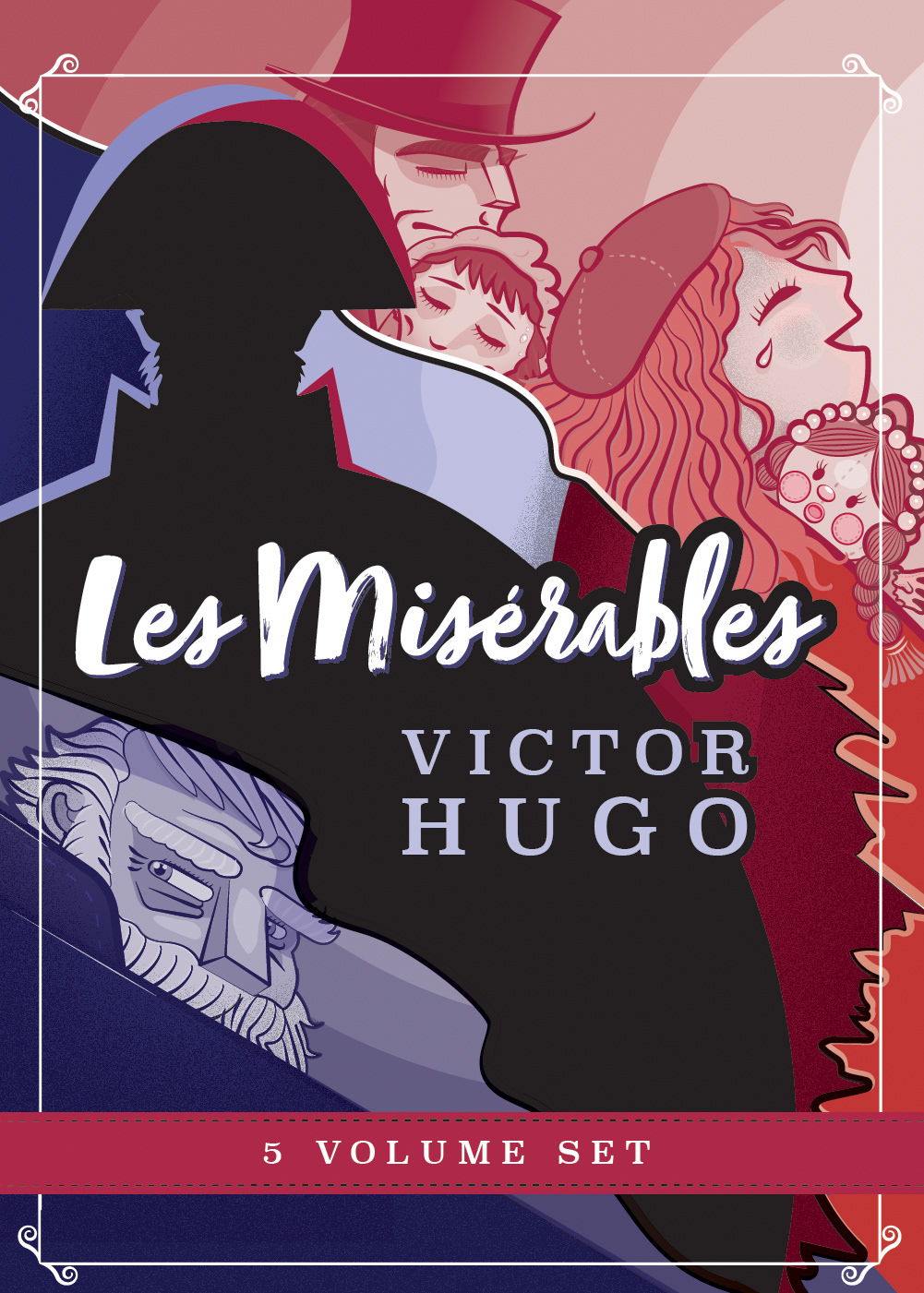
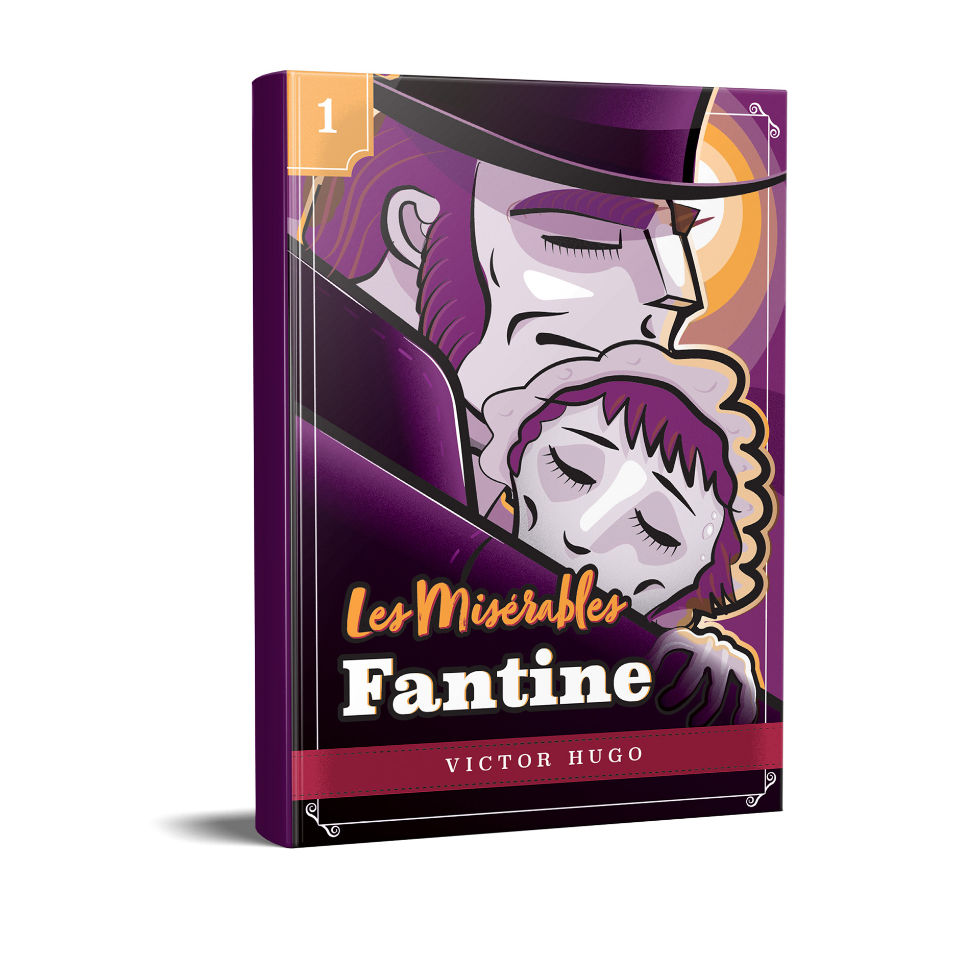
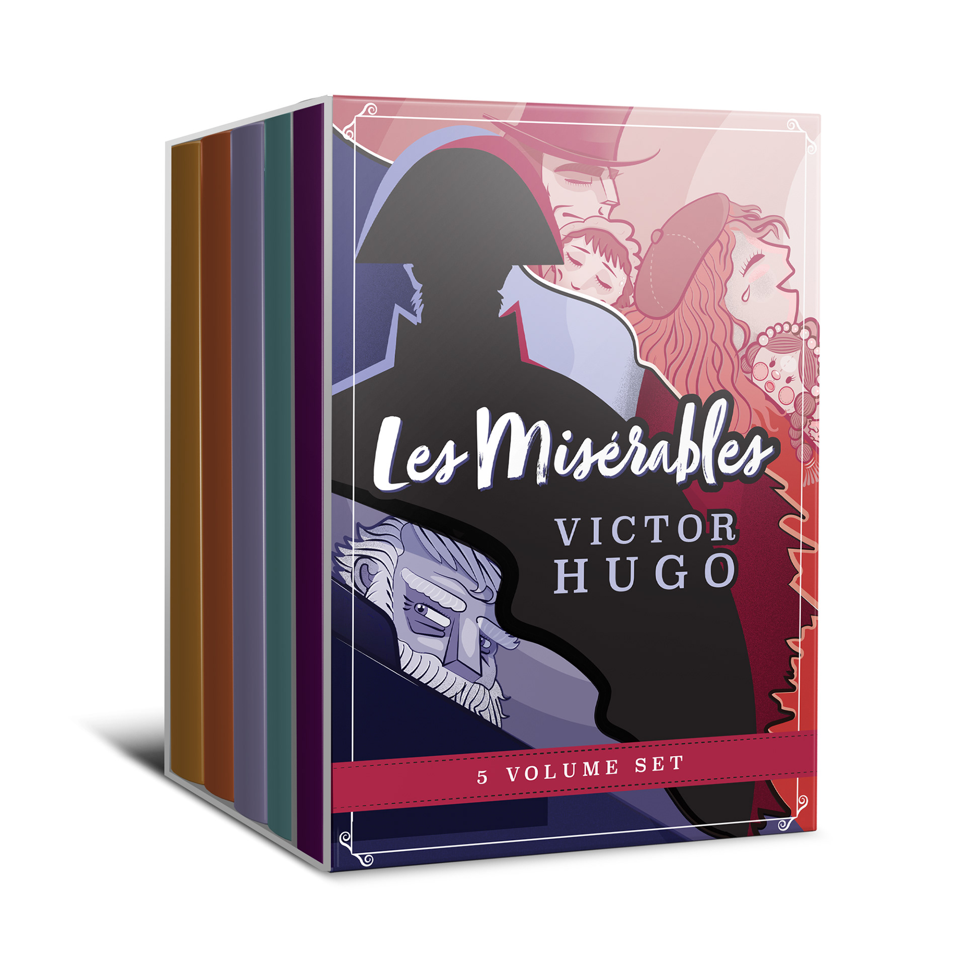
Book Cover Series
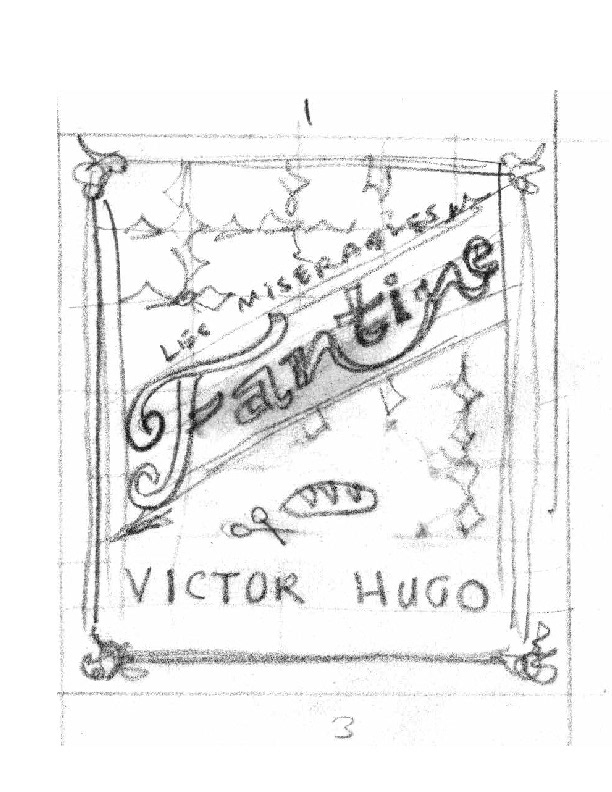
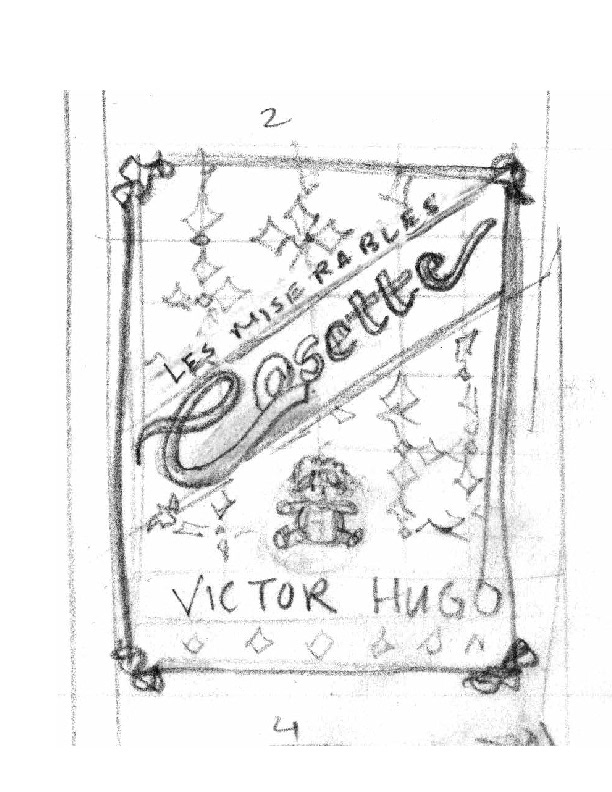
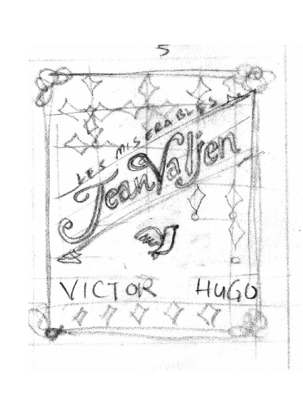
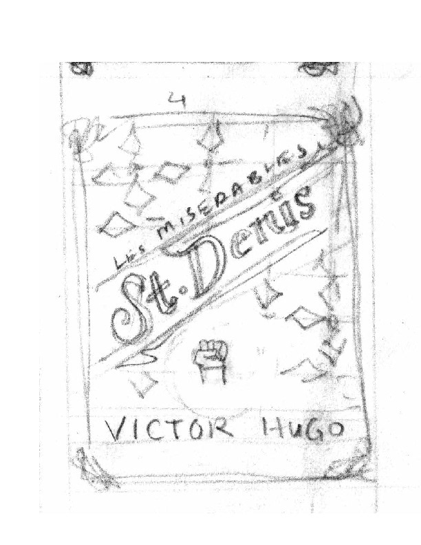
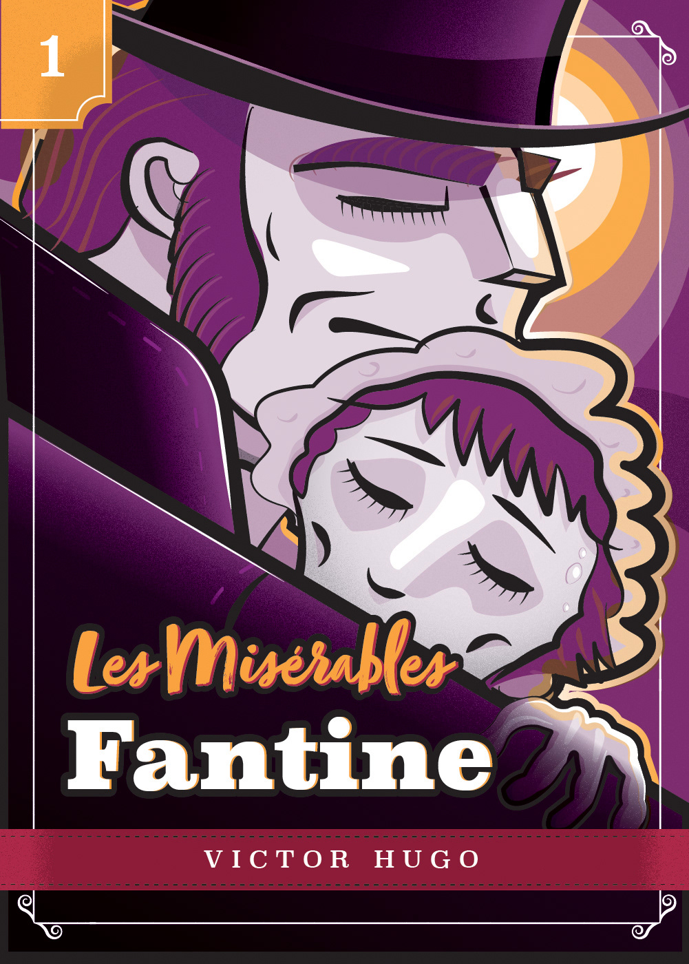
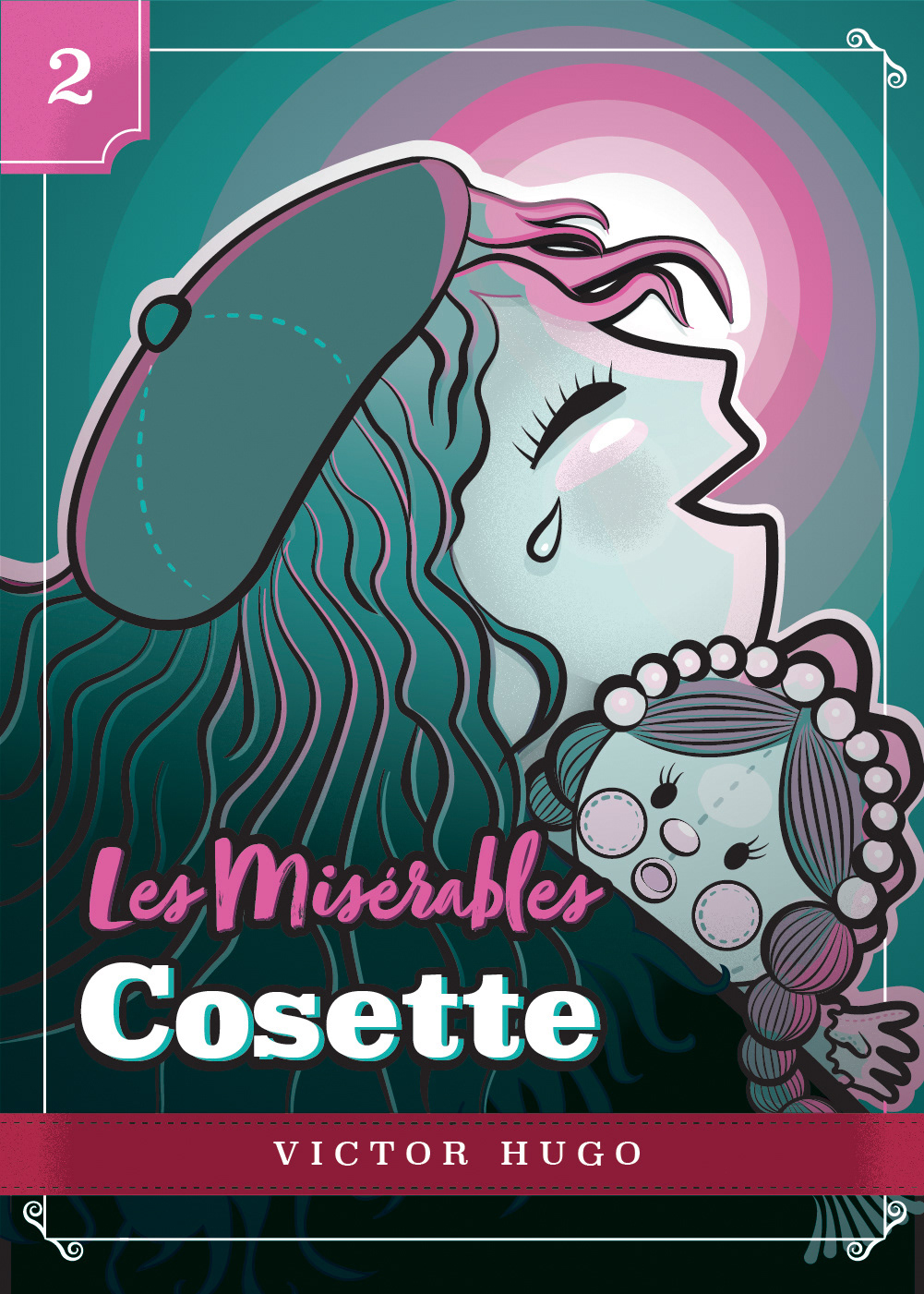
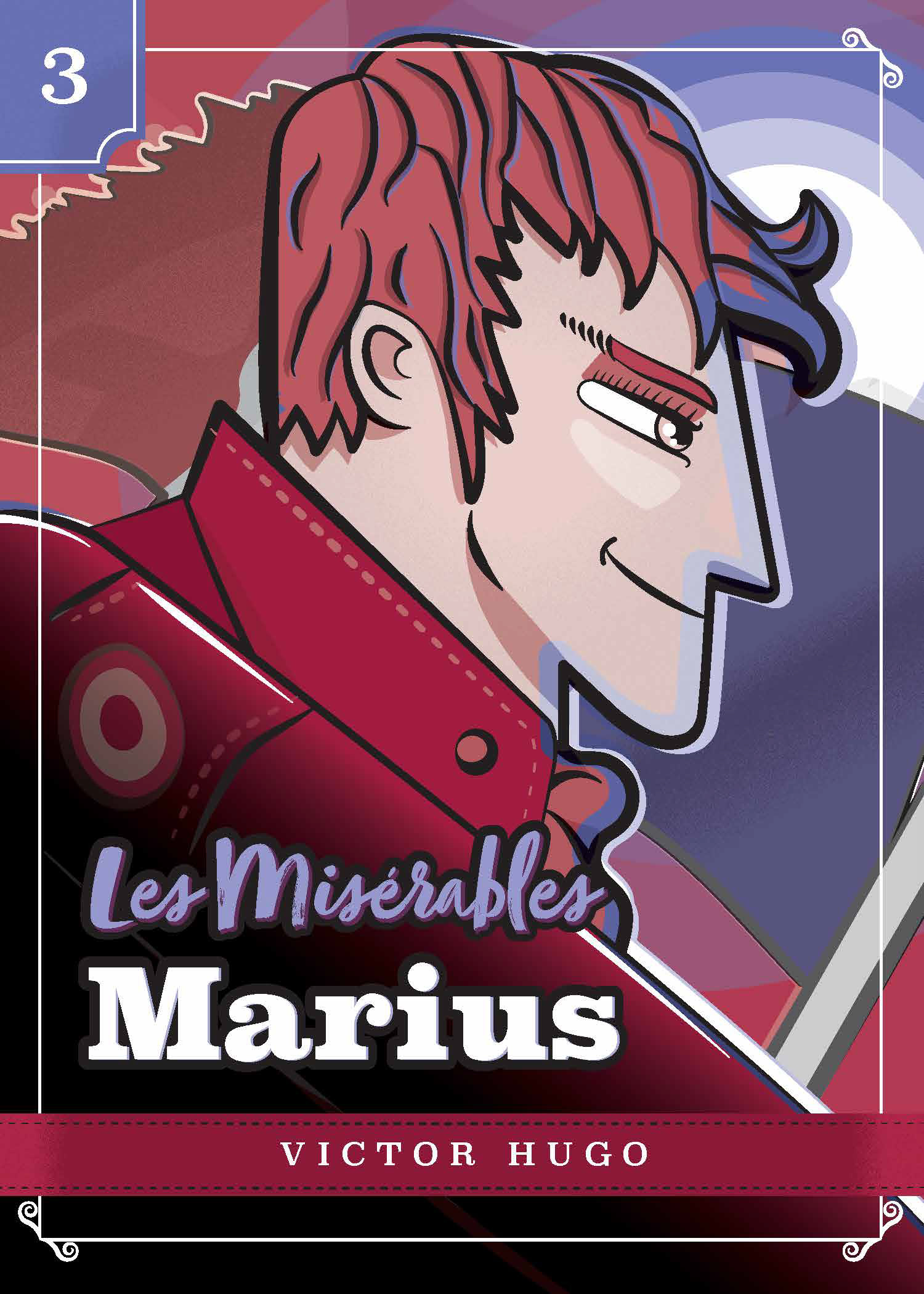
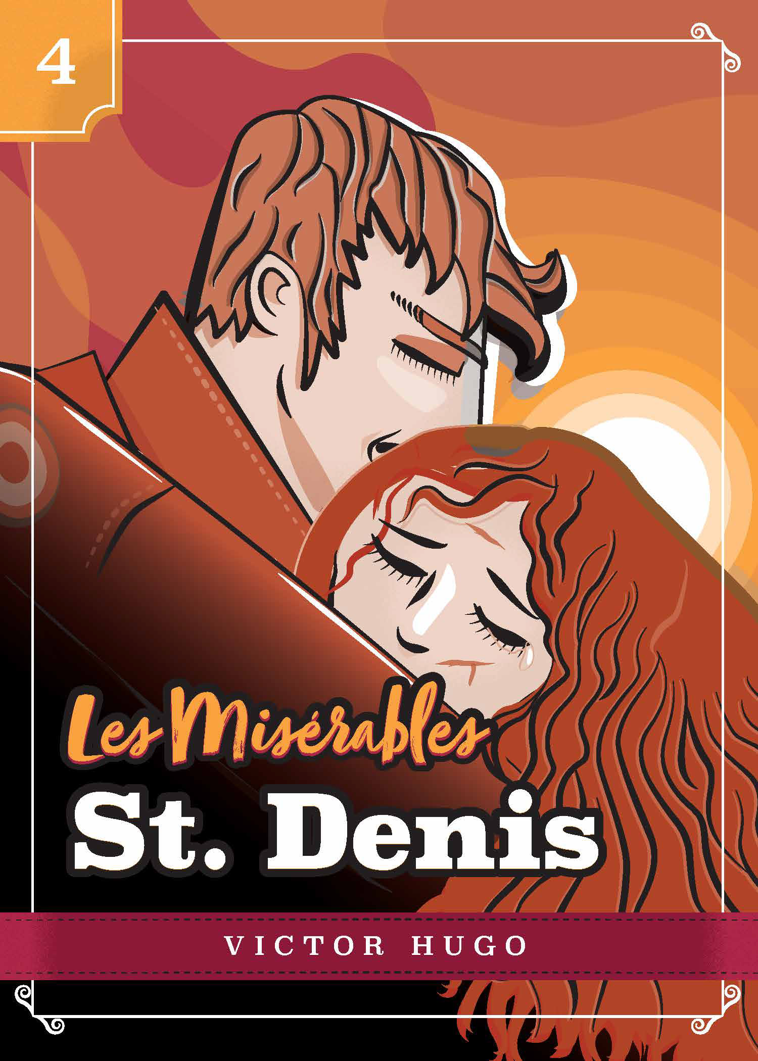
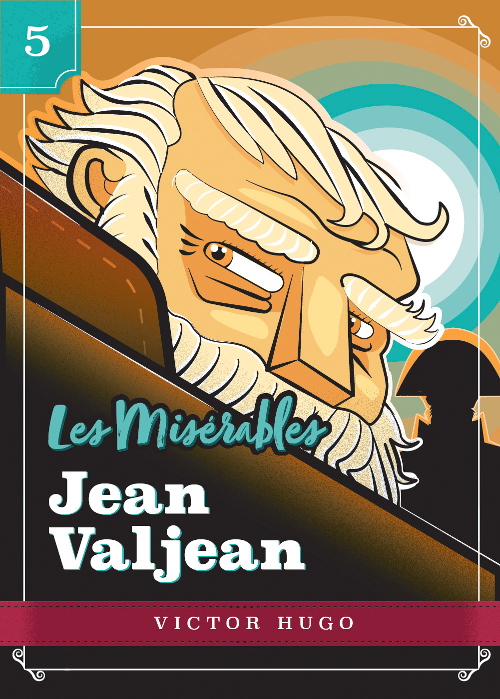
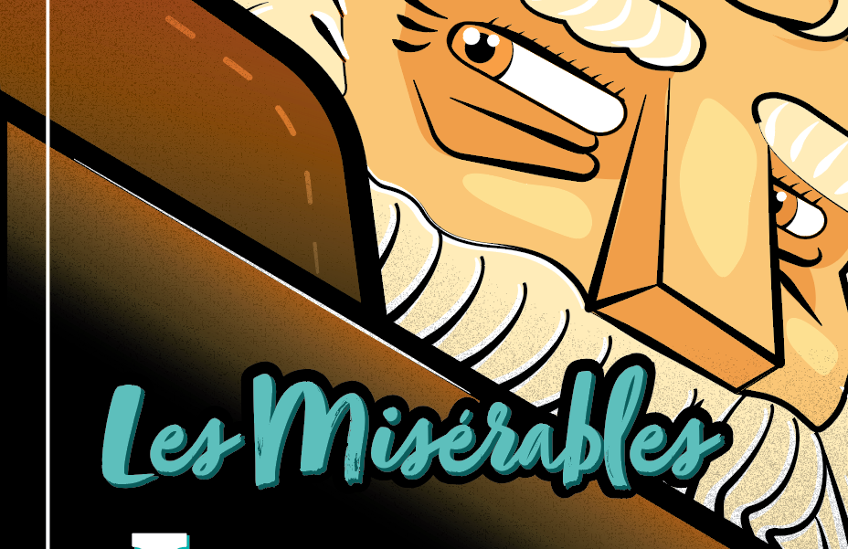
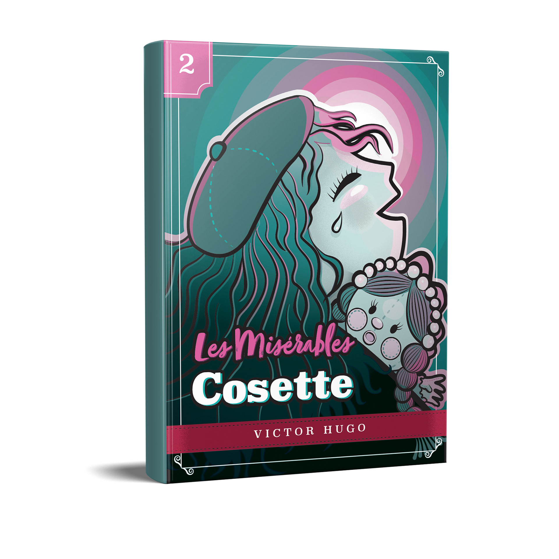
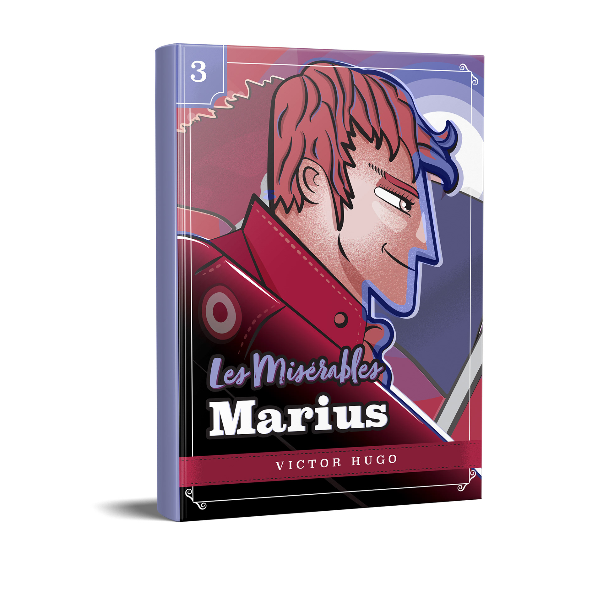
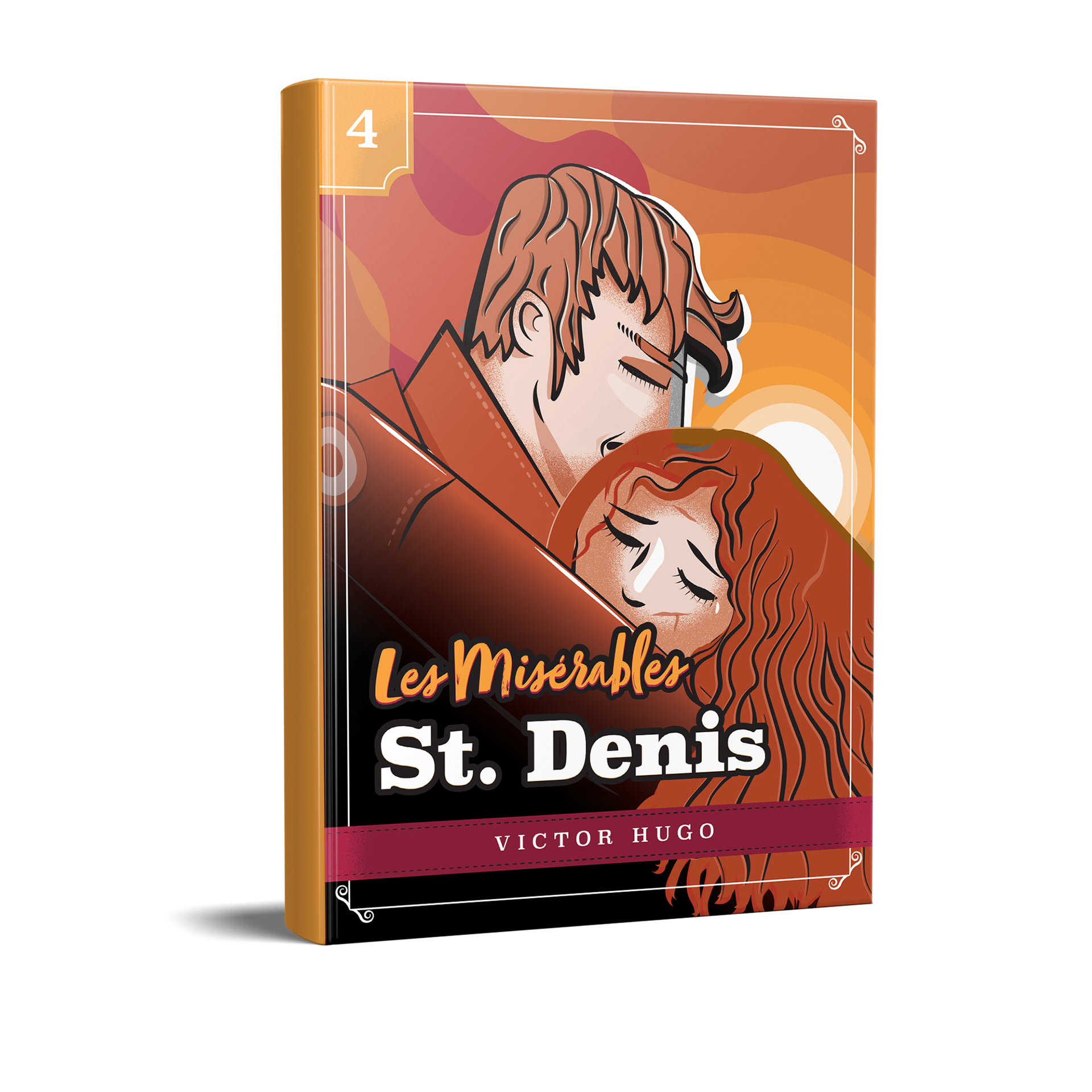
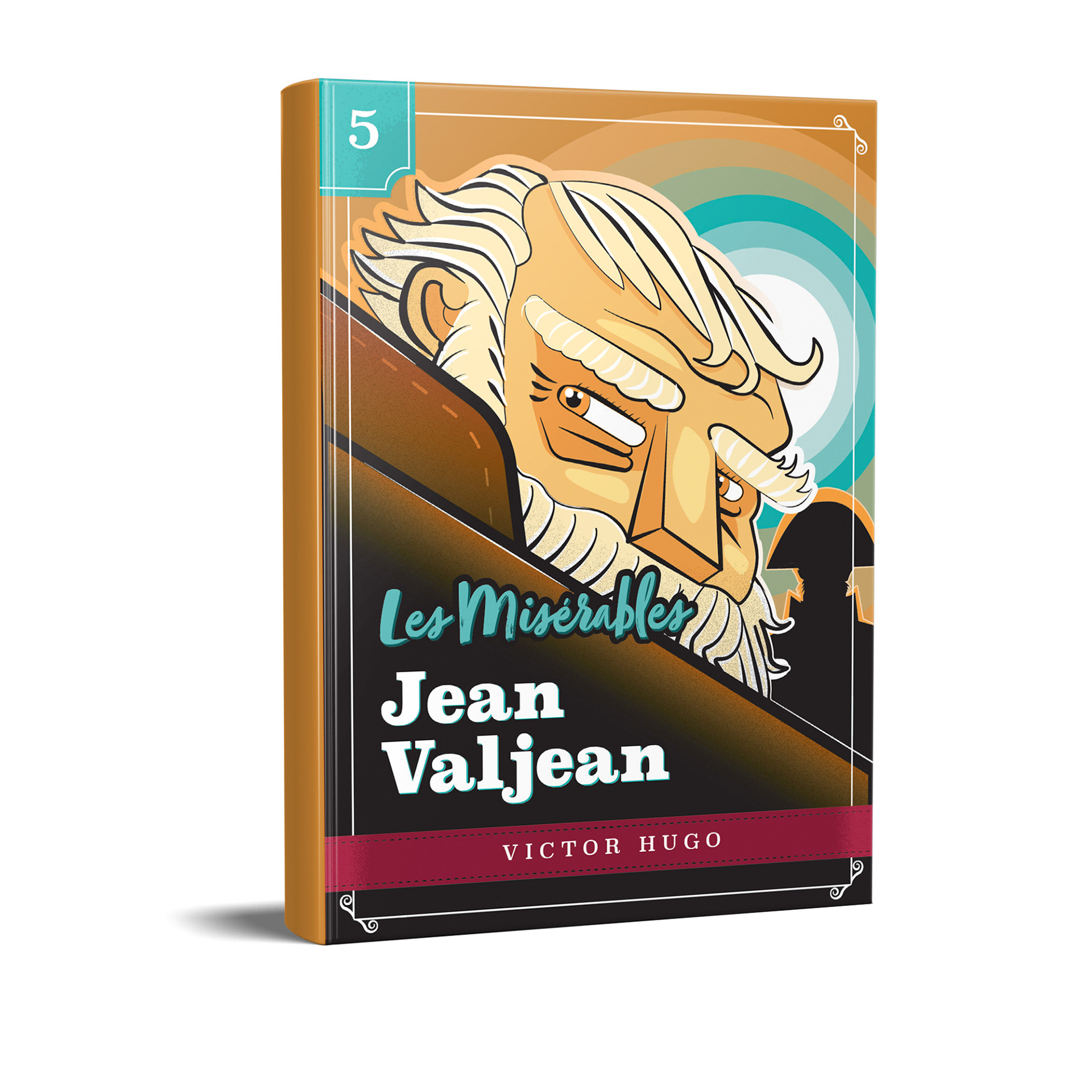
Les Misérables Novel by Victor Hugo
CONCEPT/INSPIRATION
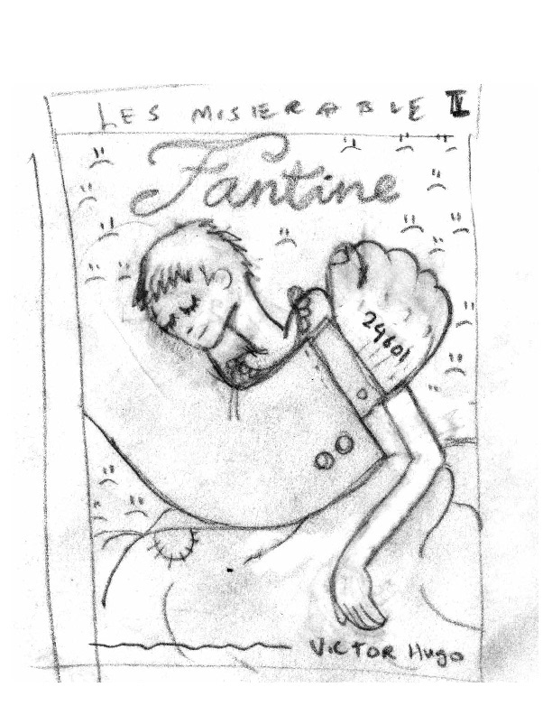
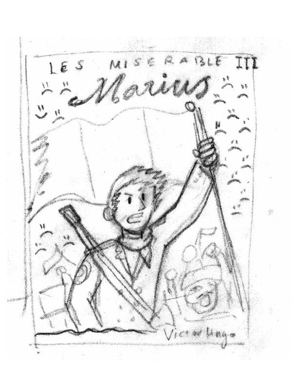
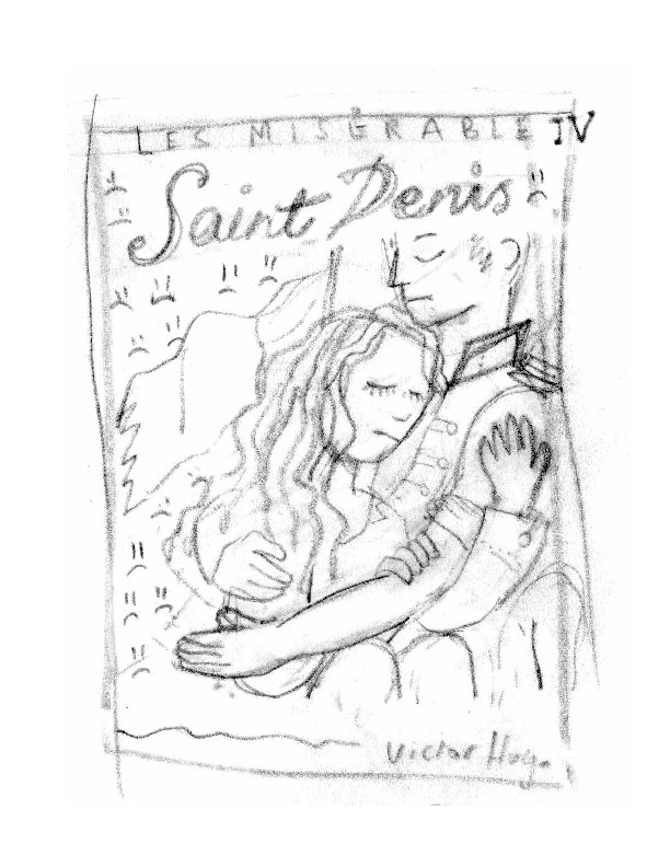
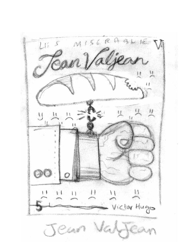
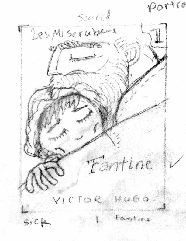
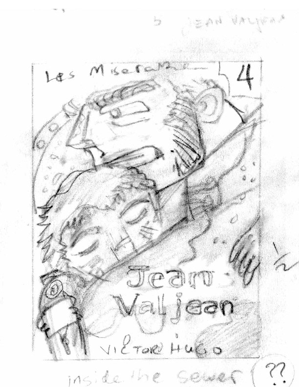
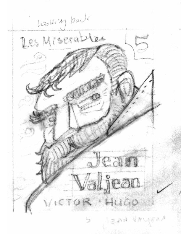
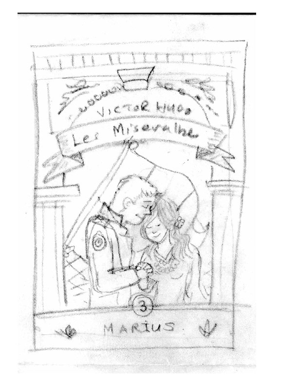
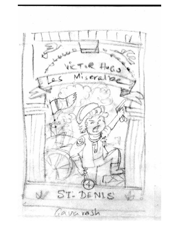
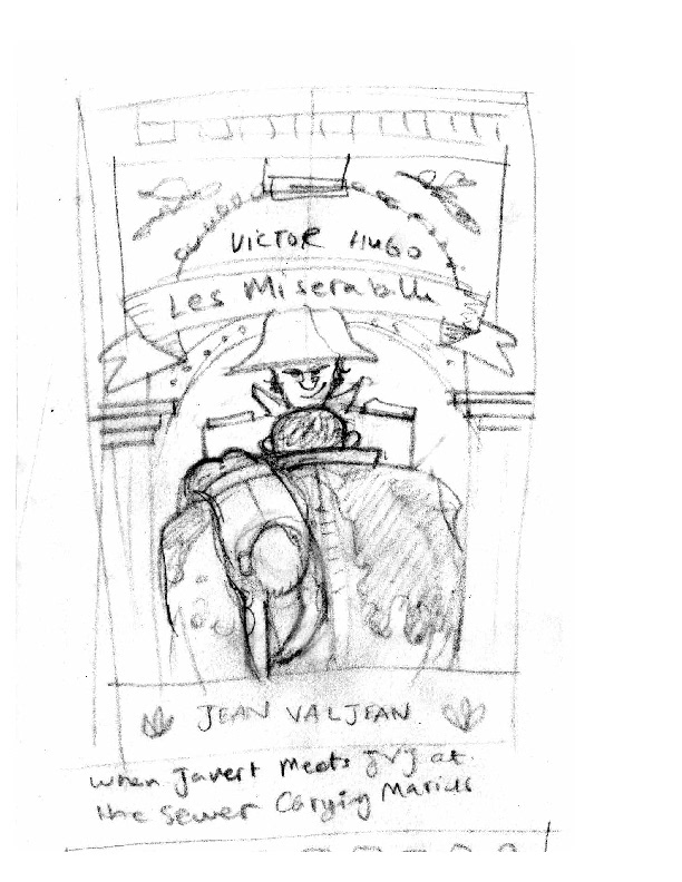
I created cover illustrations for various volumes of Victor Hugo's epic novel "Les Misérables," a tale that follows the life of a kind man who endures imprisonment, forever haunted by his past. After serving 19 years as a prisoner, Jean Valjean is set free by Javert, the prison officer. Valjean initially violates his parole but later redeems himself using stolen silver to transform into a respected mayor and factory owner. However, Javert remains resolute in his pursuit to return Valjean to prison.
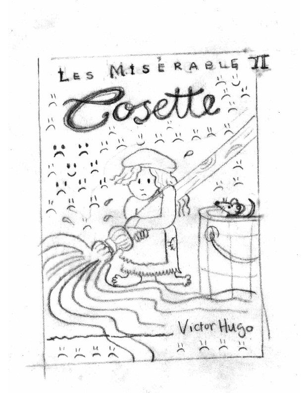
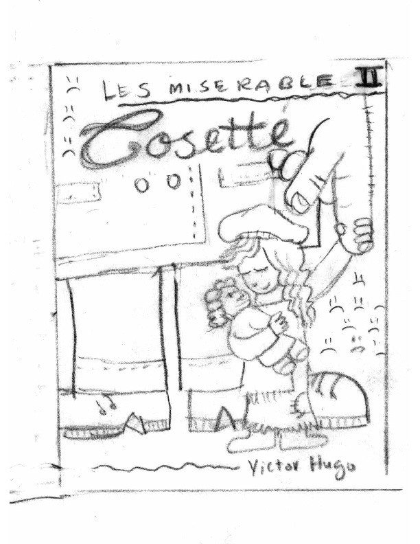
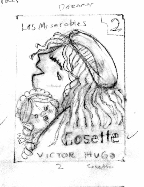
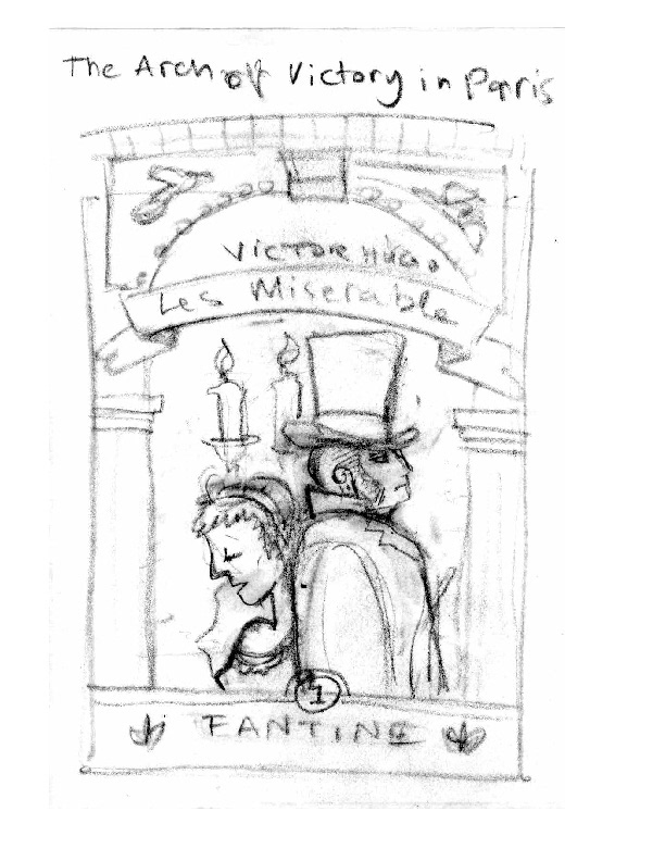
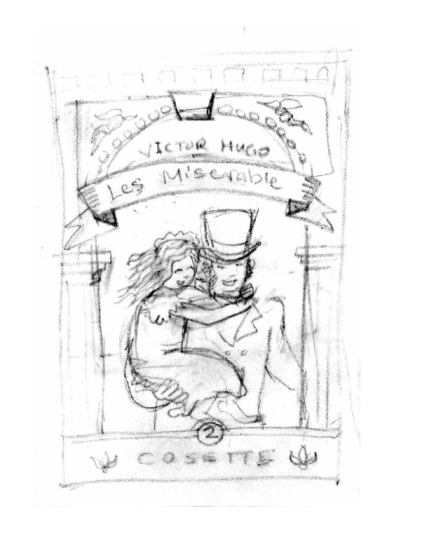
Eight years later, Valjean becomes the guardian of Cosette, a child orphaned after her mother's death. But Javert's unrelenting chase ensures that peace remains elusive. This sweeping story unfolds against the backdrop of the tumultuous French Revolution in the 1800s.
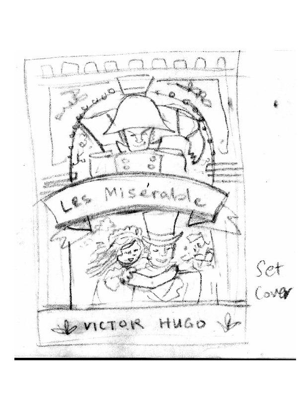
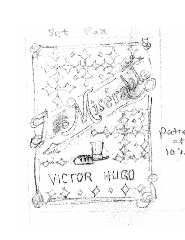
My inspiration for creating these cover illustrations was to capture the essence of a classic, multi-volume novel, exemplified by Victor Hugo's masterpiece published in 1862, hailed as one of the 19th century's greatest literary works. I chose a whimsical, cartoonish style for the covers, perhaps influenced by my affection for cartoons.
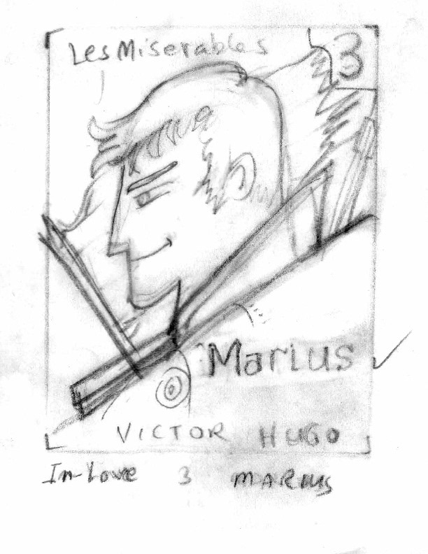
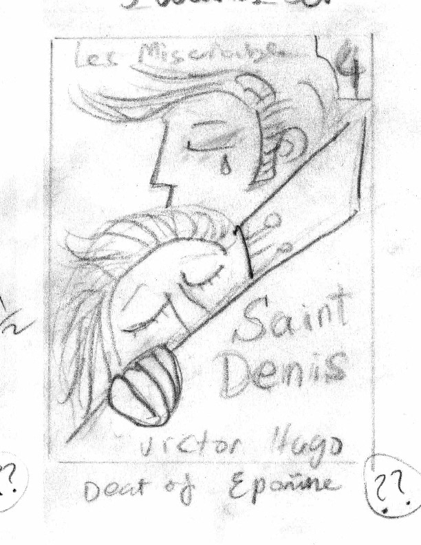
My personal connection to "Les Misérables" runs deep, as I grew up engrossed in its pages, deeply connecting with characters like Jean Valjean, Cosette, Fantine, Marius, Gavroche, Éponine, and even the enigmatic Inspector Javert. Over the years, I've been moved by various adaptations, including the 2012 musical film directed by Tom Hooper, which received numerous accolades. Although I also watched the 2018 TV series directed by Tom Shankland, I hold a special fondness for the 1967 episode of the TV show "Manga Fairy Tales of the World" or Manga sekai mukashi banashi that I grew up with, with its enchanting cartoon animation
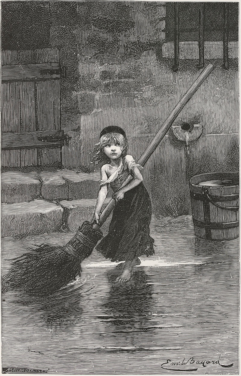
Cosette" by Emile Bayard, from the original edition of Les Misérables (1862)
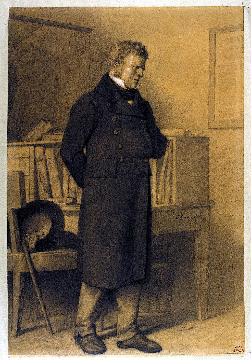
Jean Valjean, under the alias Monsieur Madeleine, illustration by Gustave Brion
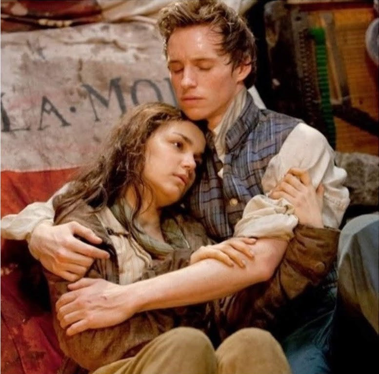
Marius and Eponin, Les Misérables movie (2012)
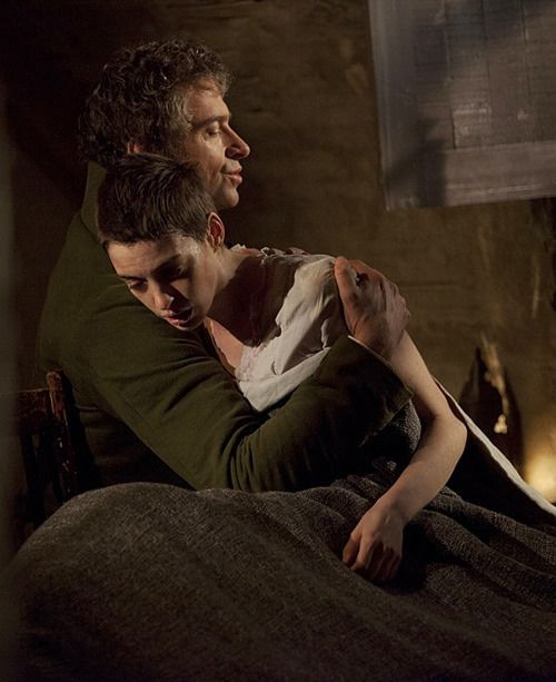
Jean Valjean and Fantine, Les Misérables movie (2012)
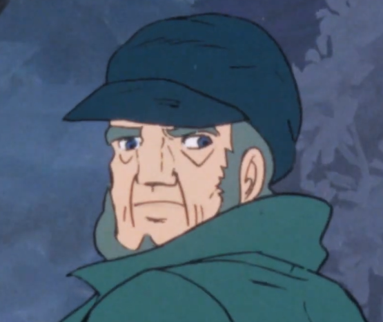
Jean Valjean, Manga sekai mukashi banashi, TV show (1967)
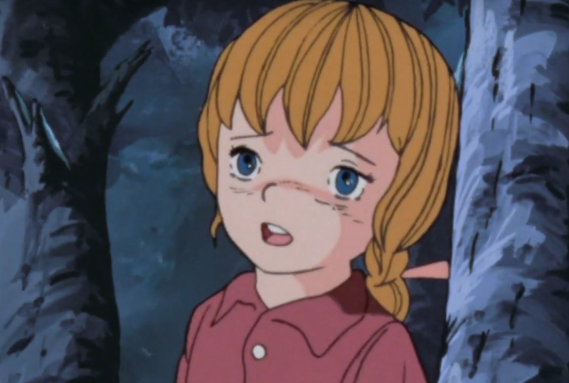
Cosette, Manga sekai mukashi banashi, TV show (1967)
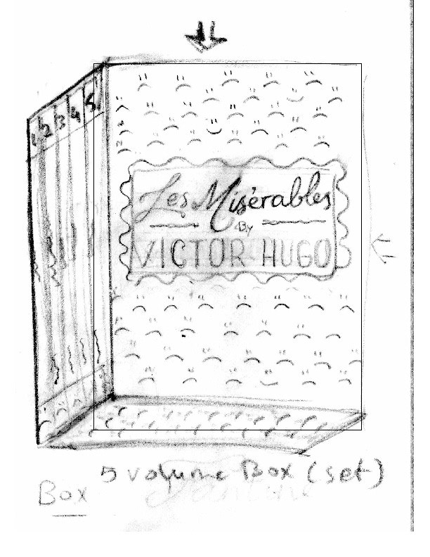
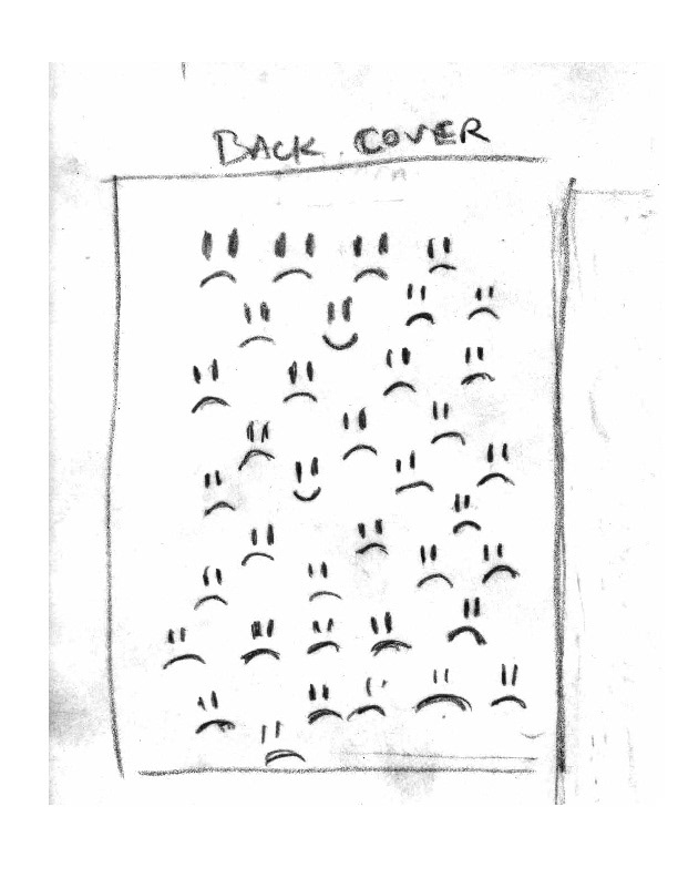
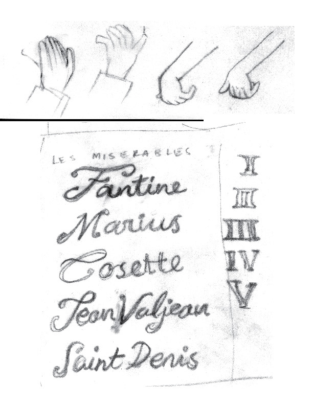
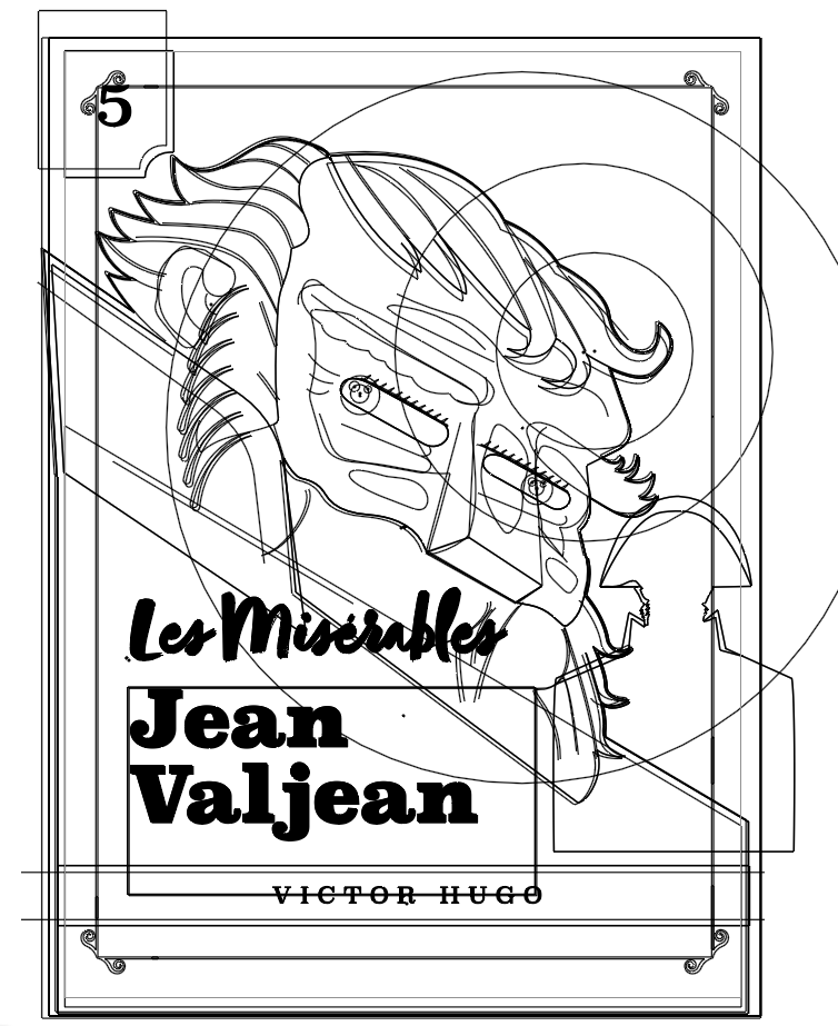
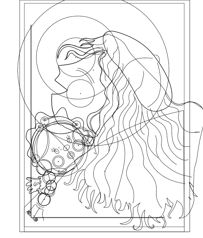
INITIAL SKETCHES
COLOR PALETTE
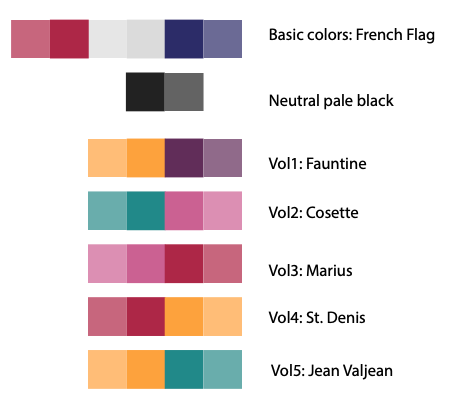
ILLUSTRATION PROCESS

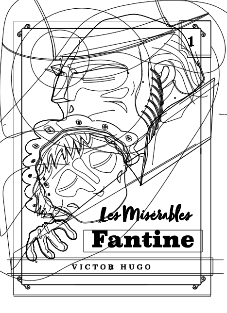
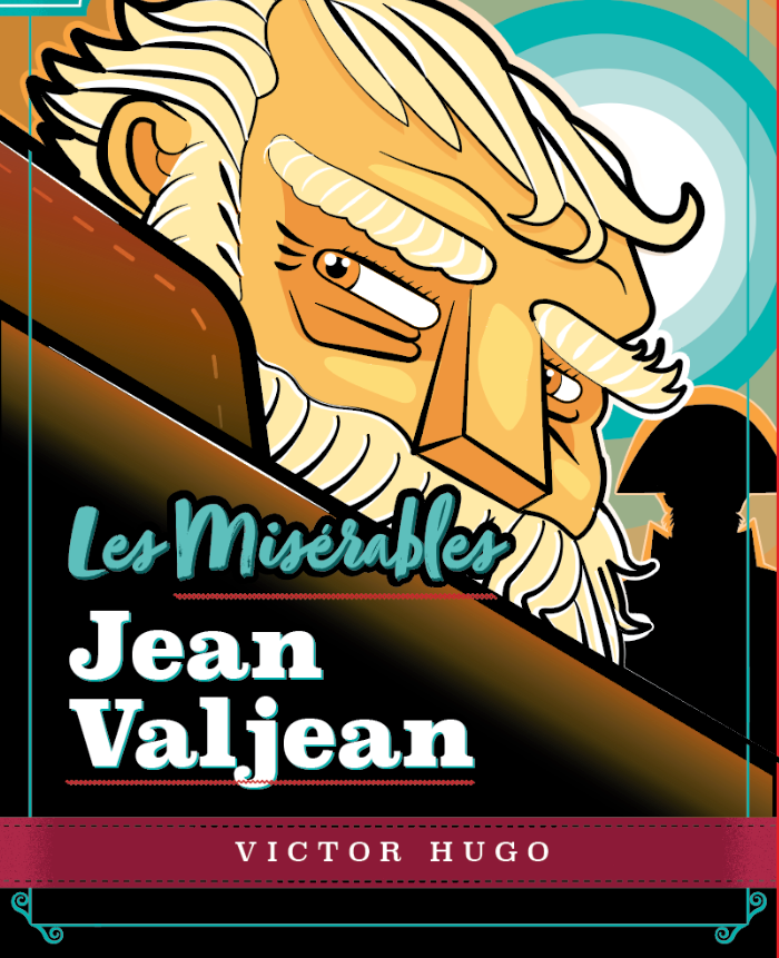
FINAL VECTOR ILLUSTRATION
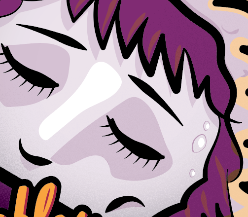
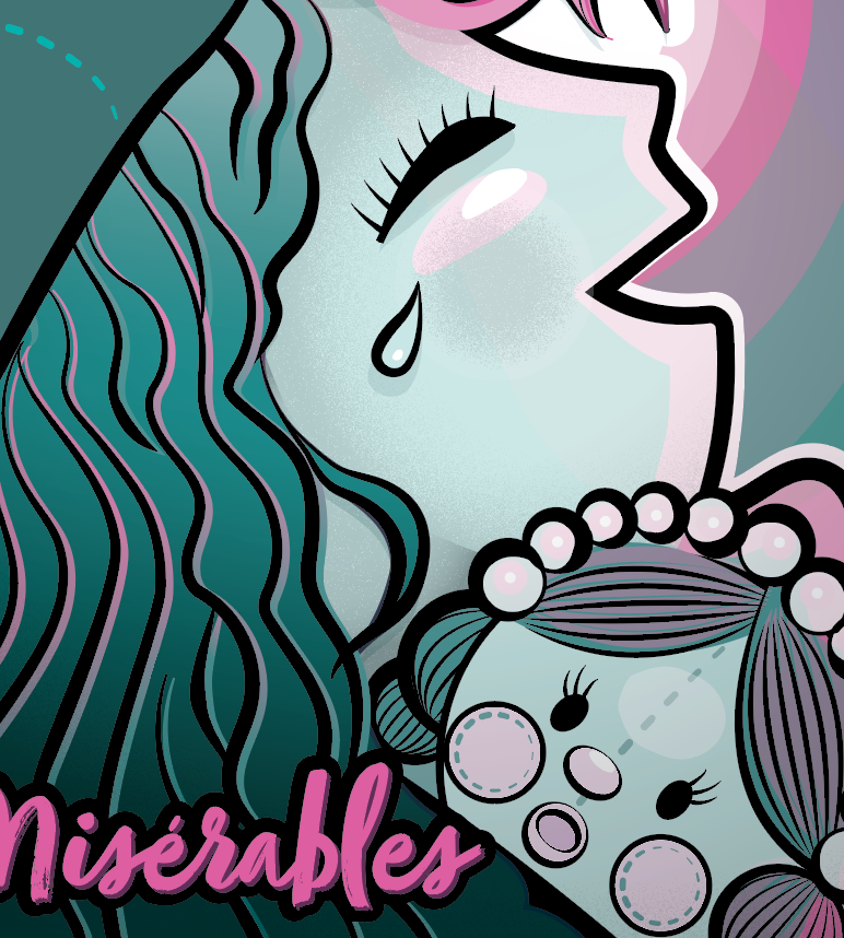
DETAILS
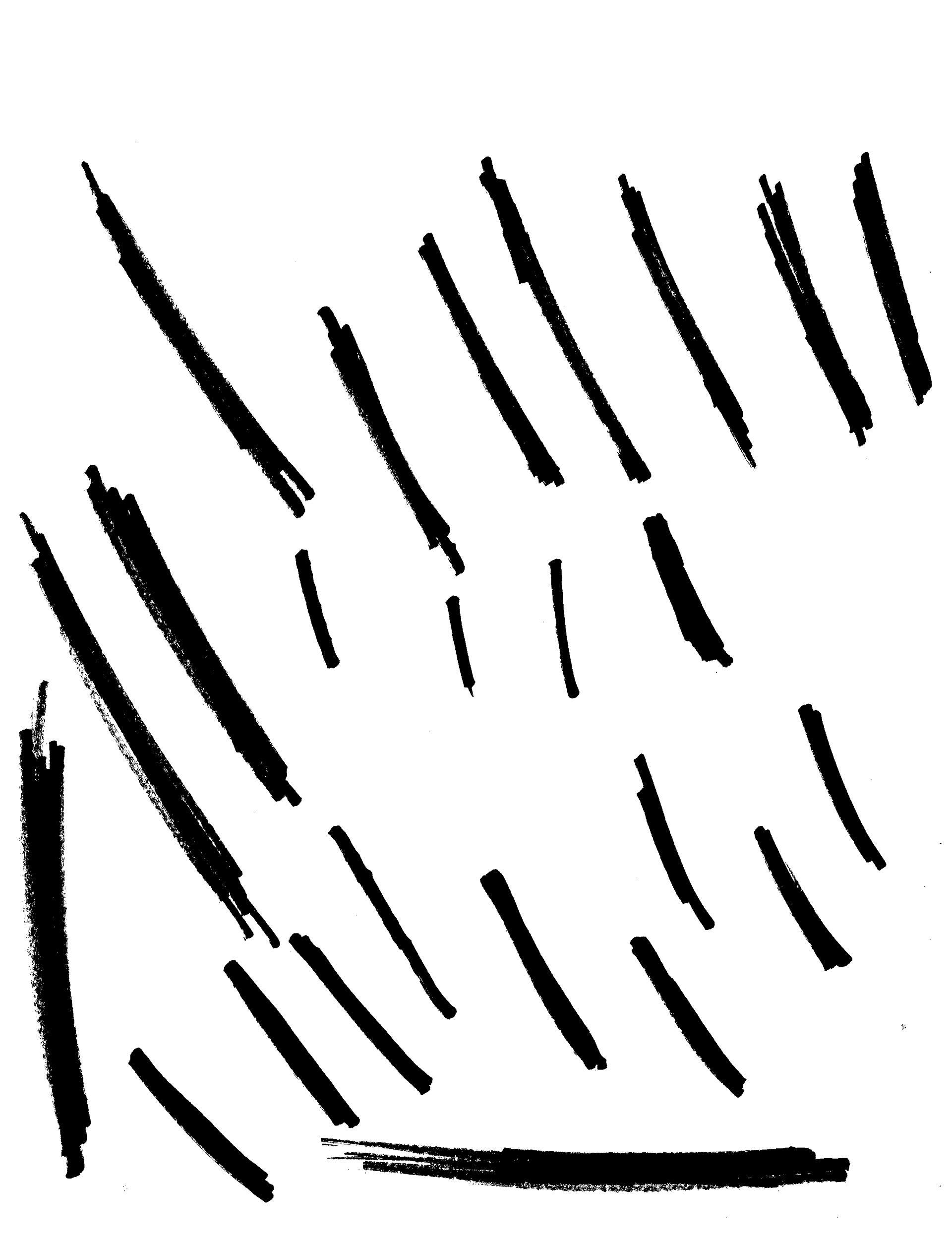
Some details show techniques like gradient grains and brush strokes.
MOCKUPS
THANKS!
Firas Ota Bachi © 2021